UI vs UX Design: What’s the Difference?

UI and UX are often discussed together, but they describe different parts of digital product design. A website, mobile app, SaaS platform, or e-commerce store can look attractive while still being difficult to use, just as a highly usable product can feel visually outdated or inconsistent.

UI design focuses mainly on how a digital interface looks and how its visual elements are presented. UX design focuses on how people move through the product, understand information, and complete important tasks.

The strongest digital products combine both. Good UX gives users a clear and efficient journey, while good UI makes that journey visually understandable, consistent, and engaging.

What Is UI Design?

UI stands for User Interface. It includes the visual and interactive elements users see when they interact with a website or application. Buttons, typography, colors, icons, forms, cards, menus, spacing, and page layouts are all part of the interface.

A UI designer works to make these elements visually consistent and easy to recognize. Primary actions should stand out, related information should feel connected, and the visual hierarchy should make it clear what deserves attention first.

For example, on an e-commerce product page, UI design influences how the product image, price, variation selectors, quantity controls, reviews, and Add to Cart button are presented. On a SaaS dashboard, it shapes navigation, tables, charts, status indicators, forms, and action buttons.

Good UI is not simply decoration. Visual decisions can directly affect usability. Weak contrast can make text difficult to read, inconsistent buttons can confuse users, and crowded layouts can make important information harder to find.

What Is UX Design?

UX stands for User Experience. It looks at the broader experience a person has while using a product. UX design asks questions such as: Can users find what they need? Is the navigation understandable? Are forms unnecessarily complicated? Does the checkout process contain too many steps?

UX often begins before detailed interface styling. Designers may research user needs, define important user journeys, create information architecture, build wireframes, plan navigation, and test prototypes before deciding exactly how every screen should look.

Consider a booking application. The UX includes how easily users can search for a service, choose a date, select an available time, enter required information, make payment, and receive confirmation. If this journey takes ten confusing steps when it could take four clear ones, changing colors and button styles alone will not solve the problem.

UX also includes error handling, empty states, onboarding, accessibility, responsiveness, loading behavior, and the clarity of messages users receive throughout the product.

Area UI Design UX Design
Main Focus Visual interface and presentation Overall usability and user journey
Typical Elements Colors, typography, buttons, icons, spacing, components Navigation, workflows, information structure, usability, interactions
Main Question How should this interface look and communicate? How should this experience work for the user?
Common Deliverables Visual designs, component libraries, design systems User flows, wireframes, prototypes, research and testing
Primary Goal Create a clear and consistent interface Make tasks easier and more intuitive to complete

How UI and UX Work Together

UI and UX should not be treated as completely separate stages. Decisions in one area frequently affect the other. A well-planned user flow still needs a clear visual interface, while a beautiful design still needs logical navigation and usable workflows.

Imagine a lead-generation website with an attractive hero section, modern typography, high-quality images, and polished animations. The UI may look excellent. But if visitors cannot understand the service or find the contact form, the UX is weak.

The opposite can happen too. A website may have simple navigation and a logical conversion journey but use inconsistent spacing, unreadable typography, outdated visual elements, and unclear buttons. Users may still complete tasks, but the interface can make the business feel less professional.

The most effective design process considers both at the same time. UX defines what users need and how the experience should flow, while UI turns that structure into an interface that is visually clear and consistent.

Improve Your Website or App UI/UX

Why Businesses Need Both UI and UX Design

Businesses sometimes focus heavily on visual design because it is the most immediately visible part of a website or application. However, attractive screens alone do not guarantee that visitors will become customers or that users will continue using a product.

A service website may need clearer calls to action and better information hierarchy. An online store may need simpler product discovery and checkout. A SaaS platform may need more focused dashboards and role-based navigation. A mobile application may need shorter forms and clearer feedback after important actions.

These are primarily UX problems, but solving them usually requires UI changes as well. A redesigned checkout flow still needs clear buttons, form states, typography, spacing, and visual feedback.

  • UI helps create a professional and consistent visual identity
  • UX helps users complete tasks with less effort
  • UI improves visual clarity and interaction
  • UX helps reduce confusion and unnecessary steps
  • Together they can improve engagement and conversion opportunities

UI/UX Design Is an Ongoing Process

Design decisions should continue to be evaluated after launch. Analytics, customer feedback, usability testing, support requests, and product behavior can reveal problems that were not obvious during the initial design process.

Users may ignore a button that designers expected to be important. A form may have higher abandonment than expected. Customers may repeatedly ask where certain information is located. These signals can guide future UI and UX improvements.

A mature digital product also needs consistency as it grows. New pages, modules, features, and integrations should follow the same design principles rather than introducing a different visual and interaction pattern every time something is added.

Encoder IT Limited provides UI/UX design for websites, mobile applications, SaaS platforms, dashboards, e-commerce stores, and custom web applications. Our work can include user-flow planning, wireframes, interface design, design systems, responsive layouts, frontend development, and conversion-focused improvements.

UI and UX have different responsibilities, but neither works at its best alone. UX creates a clear path for users, while UI makes that path understandable and visually effective. When both are planned together, businesses can create digital products that not only look professional but are also easier and more satisfying to use.
SaaS UI/UX Design Best Practices

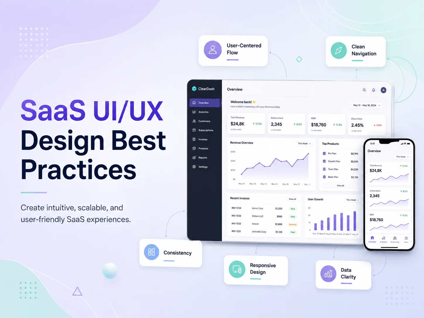
SaaS products often contain more complexity than traditional websites. Users may need to manage accounts, teams, subscriptions, projects, reports, settings, notifications, billing, and large amounts of business data from the same application. Good SaaS UI/UX design helps organize that complexity so users can understand the product quickly and complete important tasks without unnecessary friction.

The best SaaS interfaces are not simply attractive dashboards. They help new users learn the product, make frequent actions easy to reach, present information clearly, and keep the experience consistent as more features are added. Strong UI/UX can also affect activation, product adoption, customer satisfaction, and long-term retention.

Design Around User Tasks, Not Around the Feature List

A common SaaS design mistake is organizing the interface around every feature the development team has built. This can lead to large navigation menus, crowded dashboards, and screens where too many actions compete for attention.

A better approach is to understand what users actually need to accomplish. A project-management platform may have dozens of features, but a typical user may spend most of their time checking assigned work, updating task status, communicating with teammates, and reviewing deadlines. Those workflows should be easier to reach than rarely used configuration options.

User roles also matter. Administrators, managers, employees, customers, and other users may need different information. Showing every user the same dashboard can create unnecessary complexity. Role-based navigation and dashboards can surface the features that are most relevant to each person’s responsibilities.

Progressive disclosure can also help. Advanced settings do not need to appear immediately if most users rarely change them. Keeping secondary options behind clear menus or expandable areas allows the primary interface to remain focused without removing functionality.

UIUX-banner-2

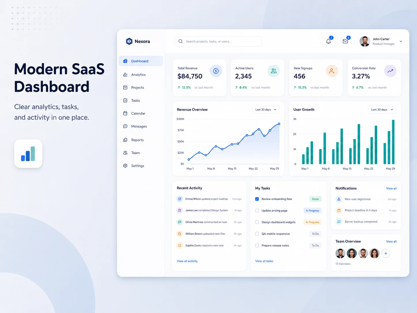
Make Dashboards Useful, Not Just Visually Impressive

The dashboard is often the first screen users see after logging in, so it should answer useful questions immediately. What requires attention? What changed recently? What should the user do next? A dashboard filled with decorative charts but no clear purpose can look sophisticated while providing very little practical value.

Important metrics should be selected based on the user’s goals. A sales manager might need pipeline value, upcoming follow-ups, and recent activity, while an employee dashboard may focus on assigned tasks, schedules, alerts, or deadlines. Information should be prioritized rather than giving every metric equal visual weight.

Charts and tables should also be easy to interpret. Labels, units, date ranges, status indicators, and filters need to be clear. Users should not have to guess whether a number represents today, the current month, or the complete account history.

When SaaS products contain large datasets, search, filters, sorting, saved views, pagination, and bulk actions become important UX features. A well-designed table can often be more useful than an elaborate visualization when users need to find and manage specific records.

Reduce Friction in Onboarding and Everyday Workflows

New users should be able to understand how to start without reading extensive documentation. Onboarding can guide them through the first meaningful actions, such as creating a workspace, inviting a teammate, connecting an integration, creating a project, or importing data.

However, onboarding should not become a long sequence of screens users are forced to complete before seeing the product. Contextual guidance is often more useful. Empty states can explain what belongs in a section and provide a direct action such as “Create your first project” or “Invite your team.”

The same focus on simplicity should continue after onboarding. Forms should avoid asking for information that is not required. Common actions should not be hidden under several menus. Users should receive immediate feedback when they save, update, delete, or submit something.

  • Keep primary navigation focused on frequent tasks
  • Use clear empty states with useful next actions
  • Reduce unnecessary form fields and steps
  • Provide visible success, error, and loading feedback
  • Use consistent labels for the same actions throughout the product
  • Make search, filtering, and bulk actions easy for data-heavy screens

Error states deserve particular attention. A message such as “Something went wrong” gives users little direction. When possible, explain what failed and what they can do next. If a payment method is declined, an integration disconnects, or a file upload fails, the interface should help users recover rather than leaving them stuck.

Build Consistency With a Scalable Design System

SaaS products frequently grow over several years. New modules, roles, settings, reports, and integrations are added by different designers and developers. Without a shared design system, interfaces can gradually become inconsistent.

A design system can define typography, colors, spacing, buttons, form controls, tables, cards, dialogs, alerts, navigation, status indicators, and other reusable components. This gives users a predictable experience while making new screens faster to design and develop.

Consistency is especially important for actions. If a primary button is blue in one area, green in another, and styled like a text link somewhere else, users need to relearn the interface repeatedly. The same applies to destructive actions, status colors, filters, confirmation dialogs, and form validation.

Responsive behavior should be part of the design system too. Many SaaS products are primarily used on desktop, but users may still check reports, approve requests, respond to notifications, or manage urgent tasks from tablets and phones. Important workflows should remain usable across appropriate screen sizes even if some complex administrative views are optimized for larger displays.

Improve Your SaaS Product Experience

Use Real Product Behavior to Improve the UX

SaaS UI/UX design should continue evolving after launch. Analytics can reveal which features are heavily used, where users abandon onboarding, and which workflows take more steps than expected. Support tickets and customer interviews can reveal problems that analytics alone cannot explain.

If customers repeatedly ask how to perform the same task, the issue may not be a lack of documentation. The interface itself may need to become clearer. If users rarely discover an important feature, its navigation or positioning may need improvement. If a form has a high abandonment rate, unnecessary fields or confusing validation may be creating friction.

Teams should prioritize improvements based on user impact rather than redesigning the product simply to make it look newer. Small changes to navigation, onboarding, table controls, forms, or feedback states can sometimes improve usability more than a complete visual redesign.

Encoder IT Limited provides UI/UX design and development for SaaS platforms, dashboards, customer portals, business applications, and other complex web products. Our work can include user-flow planning, wireframes, design systems, responsive interfaces, dashboard design, frontend development, and conversion-focused UX improvements.

Effective SaaS design makes complex software feel easier than it actually is. Clear navigation, useful dashboards, focused workflows, consistent components, strong feedback, and continuous improvement help users understand the product faster and accomplish more with less effort.

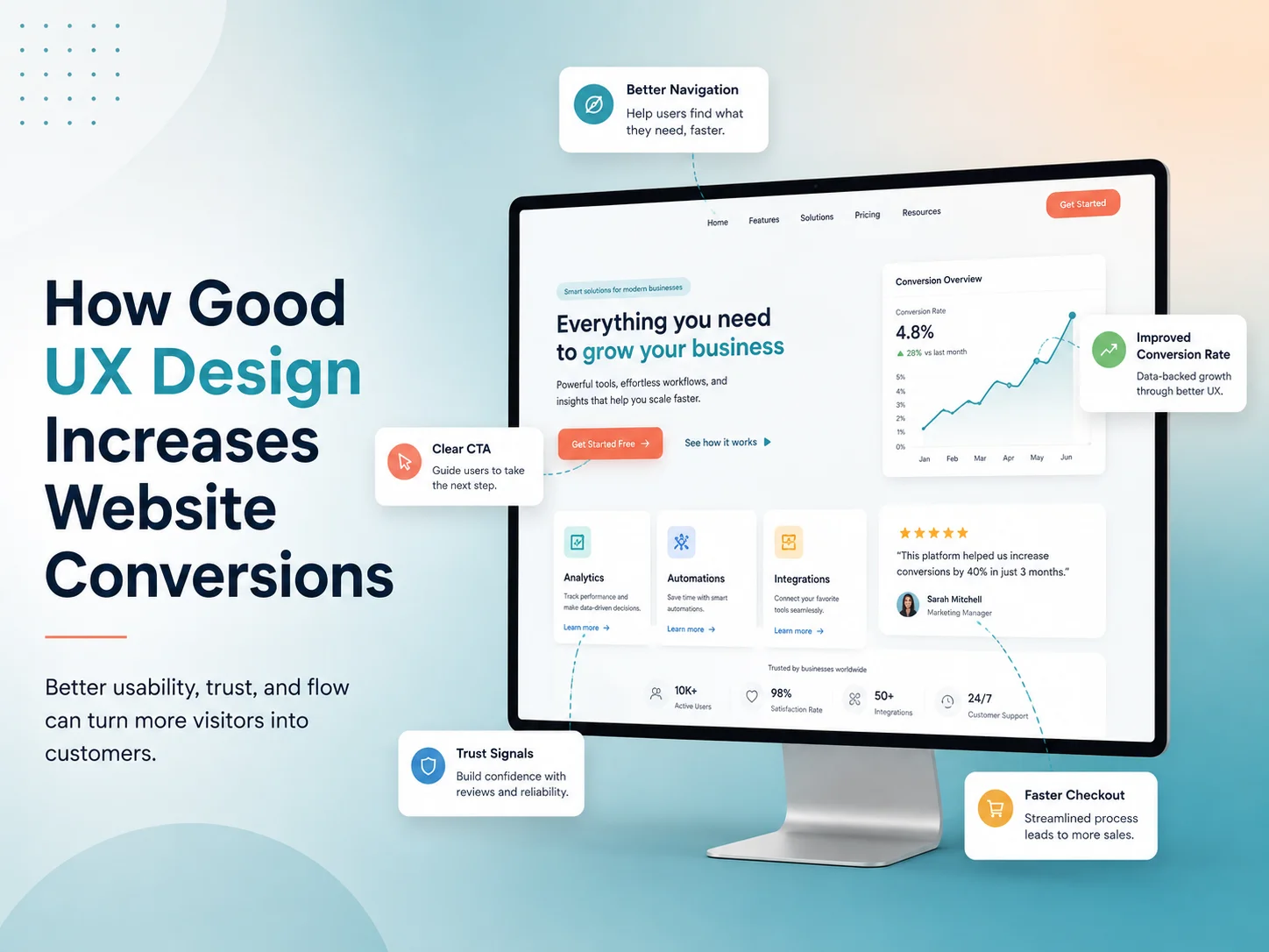
How Good UX Design Increases Website Conversions

A website can attract plenty of visitors and still generate very few inquiries, bookings, registrations, or sales. One common reason is poor user experience. If visitors cannot quickly understand what a business offers or how to take the next step, they are more likely to leave.

Good UX design can increase website conversions by making the customer journey clearer, faster, and easier to complete. It removes unnecessary friction between a visitor arriving on the website and taking an important business action.

Better UX does not force users to convert. It removes the confusion and friction that can prevent interested visitors from taking action.

What Is a Website Conversion?

A conversion happens when a website visitor completes a valuable action. Depending on the business, this may include purchasing a product, requesting a quote, submitting a contact form, booking an appointment, registering for an account, or starting a free trial.

UX design helps make these actions easier to understand and complete.

Make Navigation Simple and Clear

Visitors should be able to find important information without searching through complicated menus or confusing page structures. Clear navigation helps users move naturally between services, products, pricing, contact information, and other key pages.

When users can find what they need quickly, they are more likely to continue toward a conversion instead of leaving the website.

Use Clear Calls to Action

Calls to action such as “Request a Quote,” “Book a Consultation,” or “Start Free Trial” should be easy to identify and clearly explain what happens next. Too many competing buttons can make users unsure about which action they should take.

Good UX creates a clear visual hierarchy so the primary action receives the right level of attention.

Simplify Forms and Checkout Processes

Long or complicated forms can create unnecessary friction. If a quote form asks for information that is not needed at the first stage, visitors may abandon it before submitting.

UX design helps remove unnecessary fields, organize required information logically, provide useful validation, and make forms easier to complete on both desktop and mobile devices.

Build Trust Through Professional Design

Visitors are more comfortable taking action when a website feels professional, consistent, and reliable. Clear typography, organized layouts, predictable interactions, secure checkout experiences, and accurate information can all support trust.

Confusing layouts, broken pages, inconsistent buttons, or unclear pricing can make potential customers hesitate even when they are interested in the service.

Improve Mobile User Experience

A website should make important actions easy to complete on smartphones and tablets. Buttons should be easy to tap, forms should fit smaller screens, content should remain readable, and menus should be simple to navigate.

A poor mobile experience can create unnecessary barriers between interested users and actions such as calling the business, submitting a form, or completing a purchase.

Improve Website Speed and Responsiveness

User experience also includes how quickly and smoothly the website responds. Slow pages, delayed buttons, layout shifts, or unnecessary loading screens can interrupt the customer journey.

Improving images, scripts, server performance, and frontend code can create a smoother experience and reduce opportunities for users to abandon the website.

Guide Users With Better Content Structure

Visitors usually scan a page before reading it carefully. Clear headings, short paragraphs, useful visuals, and properly organized information make it easier to understand the value of a product or service.

A strong page structure should answer important customer questions and naturally guide visitors toward the next step without overwhelming them with unnecessary information.

Reduce Friction Throughout the User Journey

Every unnecessary step creates another opportunity for a visitor to leave. Good UX design reviews the full journey from landing page to conversion and identifies where users may become confused or frustrated.

  • Complicated navigation
  • Unclear calls to action
  • Long forms
  • Hidden pricing or important information
  • Poor mobile layouts
  • Confusing checkout steps

Removing these barriers can make the conversion process much easier.

Use Data to Improve UX

UX improvements should not depend only on personal preference. Analytics, conversion funnels, user feedback, heatmaps, and testing can help identify where visitors are leaving or struggling.

Businesses can then improve specific pages, forms, calls to action, or workflows based on real user behavior instead of redesigning the entire website without evidence.

How Encoder IT Limited Can Help

Encoder IT Limited provides UI/UX design, website development, web application development, and conversion-focused redesign services for businesses that want more effective digital experiences.

Our services can include UX planning, responsive UI design, website redesign, landing pages, performance improvements, custom WordPress development, and React or Next.js frontend development.

Request a Quote

Final Thoughts

Good UX design can improve website conversions by making it easier for visitors to understand your business, find important information, trust the website, and complete the next action.

Instead of focusing only on how a website looks, businesses should consider the complete customer journey. A clear, fast, responsive, and user-friendly experience can turn more interested visitors into leads and customers.

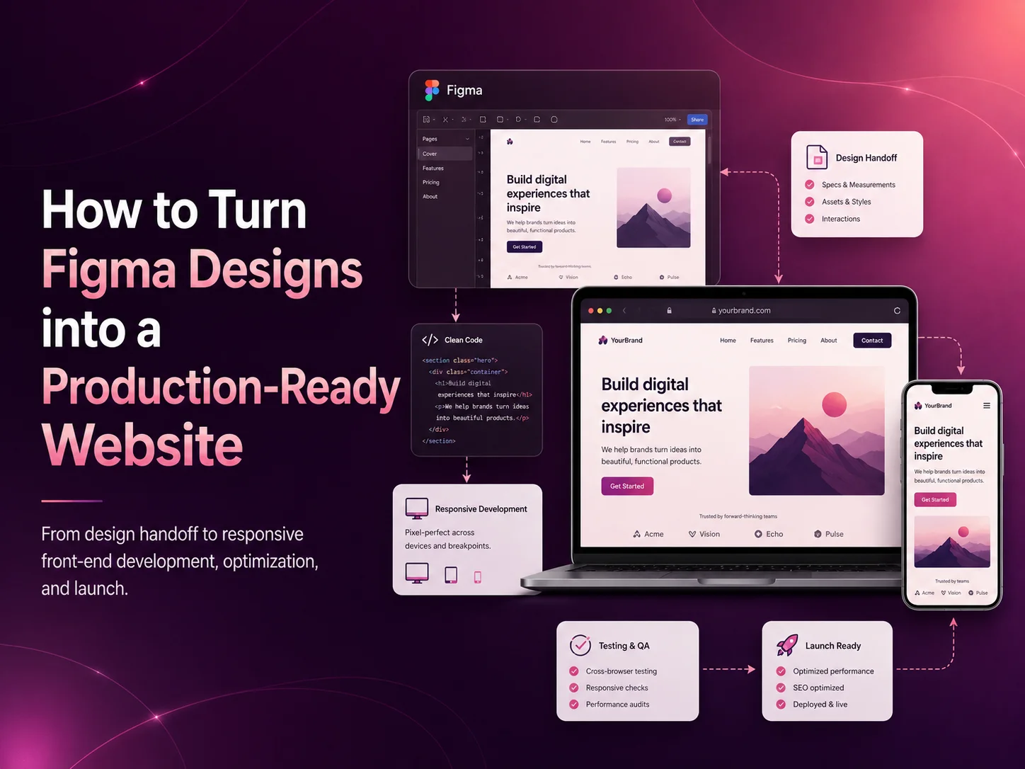
How to Turn Figma Designs into a Production-Ready Website

Figma is widely used to design modern websites, dashboards, SaaS platforms, and web applications before development begins. But turning a polished design into a production-ready website requires more than simply copying colors, spacing, and layouts.

The final website needs to be responsive, fast, accessible, maintainable, and connected with real functionality while still matching the original Figma design closely.

A production-ready website should not only look like the Figma design—it should also perform reliably across devices, browsers, and real-world user scenarios.

Start by Reviewing the Complete Figma Design

Before writing code, developers should inspect the complete design rather than working from individual screenshots. This includes typography, spacing, colors, component states, responsive layouts, icons, images, forms, and interactive elements.

It is also important to identify reusable design patterns such as buttons, cards, navigation elements, form fields, and content sections before development begins.

Build Reusable Components

A professional website should not duplicate the same code across multiple pages. Reusable components make the project easier to maintain and help keep the implementation consistent with the design system.

For example, developers can create shared components for buttons, headers, cards, forms, modals, and content sections. These components can then be reused throughout the website while maintaining consistent styling and behavior.

Match Typography, Spacing, and Colors Carefully

Small differences in font size, line height, margins, padding, or color can make a website feel noticeably different from the original Figma design.

Developers should use the measurements and design tokens provided in Figma instead of estimating them visually. A consistent spacing and typography system also makes future changes easier.

Make the Website Fully Responsive

A Figma file may include desktop and mobile layouts, but the website also needs to work across the many screen sizes between them. Developers should create responsive behavior for navigation, grids, typography, images, forms, and interactive components.

The goal is not simply to shrink desktop content. Layouts should reorganize naturally so the website remains easy to use on tablets and smartphones.

Use the Right Development Technology

The best technology depends on the type of website being built. A content-focused business website may be developed with WordPress, while a highly interactive application may use React or Next.js.

Laravel, Node.js, or other backend technologies can be added when the project requires user accounts, dashboards, APIs, payments, or custom business logic.

Optimize Images and Assets

Design files often contain large images and graphics that are not ready for production. Images should be exported in appropriate formats and optimized before being added to the website.

SVG can work well for icons and simple vector graphics, while modern image formats and responsive image techniques can help reduce page weight without noticeably reducing visual quality.

Add Real Functionality

A Figma prototype may show forms, buttons, menus, filters, or dashboards, but these elements still need real development behind them.

Contact forms need validation and submission handling, account interfaces need authentication, filters need data logic, and payment screens require secure payment integrations. Developers must translate visual interactions into reliable working features.

Focus on Website Performance

A visually accurate implementation should not come at the cost of performance. Excessive scripts, unnecessary libraries, large images, and poorly structured frontend code can make the website slow.

Developers should optimize assets, load resources efficiently, minimize unnecessary JavaScript, and use caching or server-side optimization where appropriate.

Test the Website Against Figma

After development, the website should be compared with the original Figma design. Check fonts, colors, spacing, alignment, button states, responsiveness, and important interactions.

Testing should also cover major browsers, mobile devices, forms, links, error states, and real content—not only placeholder data.

What Makes a Figma Website Production-Ready?

  • Accurate implementation of the approved design
  • Responsive layouts across common screen sizes
  • Reusable and maintainable components
  • Optimized images and frontend assets
  • Working forms and integrations
  • Good performance and accessibility
  • Cross-browser testing
  • Reliable deployment and ongoing maintenance

Common Figma-to-Website Mistakes

One common mistake is focusing only on visual similarity while ignoring responsiveness, performance, and maintainability. Another is building every section separately instead of creating reusable components.

Developers should also avoid guessing dimensions from screenshots, ignoring mobile layouts, using unnecessarily large assets, or completing development without comparing the final result against the approved design.

How Encoder IT Limited Can Help

Encoder IT Limited provides professional Figma-to-website development services for businesses, startups, and SaaS products. We convert approved UI/UX designs into responsive, functional, and maintainable websites and web applications.

Our services include Figma to WordPress development, React and Next.js frontend development, custom web application development, responsive implementation, API integration, and performance optimization.

Request a Quote

Final Thoughts

Turning a Figma design into a production-ready website requires a balance between visual accuracy and technical quality. The final product should match the approved design while remaining responsive, fast, functional, and easy to maintain.

By using reusable components, responsive development, optimized assets, proper testing, and the right technology stack, businesses can turn their Figma designs into reliable websites that are ready for real users.

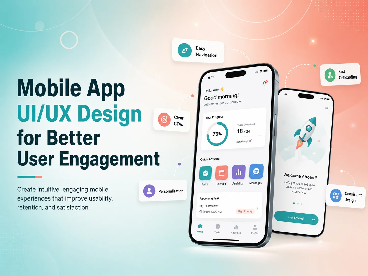
Mobile App UI/UX Design for Better User Engagement

A mobile app can have useful features and strong technology but still struggle to keep users engaged if the experience feels confusing, slow, or difficult to navigate. People expect mobile applications to feel simple, responsive, and intuitive from the first interaction.

Mobile app UI/UX design focuses on making important actions easier while creating an interface that users enjoy returning to. Good design helps users understand where they are, what they can do next, and how to complete important tasks without unnecessary effort.

For businesses, better engagement can mean more completed purchases, bookings, subscriptions, messages, content interactions, or repeated use of the application. The objective is not to keep people inside the app for as long as possible, but to help them receive value quickly enough that they want to return.

Make the First Experience Easy to Understand

The first few minutes of using an app can strongly influence whether someone continues using it. New users should not be confronted with complicated navigation, long registration forms, or a large number of features before they understand the main purpose of the application.

Onboarding should focus on helping users reach their first useful result. An e-commerce app may guide users toward products and categories. A booking application can make it easy to find a service and available time. A SaaS mobile app may help users complete one important setup action rather than explaining every feature at once.

Registration should also remain as simple as the product allows. If an account is not required immediately, users may benefit from exploring some parts of the app before being asked to register. When registration is necessary, forms should avoid unnecessary fields and clearly explain validation errors.

Empty states can also improve the first experience. Instead of displaying a blank page when a new user has no projects, orders, messages, or saved items, the interface can briefly explain what belongs there and provide a useful next action.

UIUX-banner-1

Keep Navigation and Important Actions Simple

Users should not need to remember complicated menu structures to use an app. Primary navigation should focus on the areas people use most frequently, while secondary settings and less common features can remain available without competing for attention.

For many mobile products, bottom navigation works well for a small number of important destinations because users can reach them comfortably with one hand. Other applications may benefit from tabs, search-driven navigation, or a focused dashboard. The right pattern depends on what users actually need to do.

Important actions should also remain visually clear. Buttons need comfortable touch areas, labels should explain the action, and destructive actions such as deleting information should look different from normal navigation.

Consistency plays a major role here. If “Save” appears in different positions with different styles throughout the app, users need to think more than necessary. Reusing familiar patterns reduces that mental effort and makes the product easier to learn.

Reduce Friction in the Workflows That Matter Most

User engagement is influenced heavily by how easy it is to complete the app’s main purpose. For an e-commerce app, that might be discovering and purchasing a product. For a service app, it may be booking an appointment. For a business application, the key workflow might involve updating tasks, approving requests, or reviewing information.

These high-value journeys should contain as few unnecessary steps as possible. Long forms can be divided logically, repeated information can be avoided, and previously entered data can be reused when appropriate. Users should always understand how far they have progressed and what happens next.

  • Keep forms focused on necessary information
  • Use clear feedback after important actions
  • Make errors easy to understand and correct
  • Reduce repeated data entry
  • Keep primary actions easy to reach
  • Preserve user progress where practical

Feedback is especially important on mobile because users need confirmation that the app recognized their action. Loading indicators, success messages, error states, disabled buttons, and progress indicators help users understand what the system is doing.

An app that provides no visible response after a user taps “Pay,” “Book,” or “Submit” can create uncertainty and repeated actions. Good UX removes that uncertainty.

Improve Your Mobile App Experience

Use Personalization and Notifications Carefully

Personalization can improve engagement when it genuinely makes the app more relevant. An e-commerce application might remember preferred categories, while a learning platform can continue from previous progress. A SaaS product may show information based on the user’s role instead of presenting the same dashboard to everyone.

However, personalization should not create unnecessary privacy concerns or make the experience unpredictable. Users should still understand why information is being shown and retain appropriate control over their preferences.

Push notifications are another useful engagement tool when they provide timely value. Order updates, appointment reminders, new messages, payment alerts, or important account activity can give users a reason to return to the application.

Too many notifications have the opposite effect. Repeated promotional messages can lead users to disable notifications entirely or remove the app. Businesses should focus on relevance, timing, and user control rather than maximizing the number of messages sent.

Performance Is Part of the User Experience

Visual design cannot compensate for an app that feels slow. Delayed screens, large loading states, freezing interactions, and slow API responses can quickly reduce engagement even when the interface itself looks polished.

Developers and designers should therefore consider performance together. Images should be optimized, screens should avoid loading unnecessary information, API requests should be efficient, and useful loading states should appear when processing takes time.

The app should also handle poor network conditions gracefully. Users may move between Wi-Fi and mobile connections or temporarily lose connectivity. Clear retry options, cached information where appropriate, and understandable error messages create a more dependable experience.

Accessibility contributes to usability too. Readable typography, sufficient contrast, clear labels, scalable layouts, and controls that are easy to interact with can make the product more usable for a wider range of people.

Improve Engagement With Real User Behavior

Good mobile UX continues evolving after launch. Analytics can reveal where users leave onboarding, which screens receive the most attention, and which important actions are rarely completed. Support requests and app reviews can add context by explaining why users experience problems.

If many users begin checkout but do not complete it, the team should investigate that workflow rather than redesigning unrelated screens. If users frequently search for a feature that is hidden in navigation, its position may need to change. If a feature receives almost no usage, the product team should determine whether it is difficult to discover or simply not valuable.

Encoder IT Limited provides UI/UX design and development for Android, iOS, Flutter, and React Native applications. Our work can include user-flow planning, wireframes, mobile interface design, design systems, responsive development, usability improvements, and ongoing product optimization.

Better mobile engagement usually comes from reducing friction rather than adding more features. When users can understand the application quickly, navigate confidently, complete important actions easily, and receive clear feedback throughout the experience, they have a stronger reason to continue using the product.

E-commerce UI/UX Design for Higher Customer Engagement

An e-commerce website may attract visitors through search, advertising, social media, or existing customers, but the shopping experience determines whether those visitors continue exploring the store. Confusing navigation, weak product information, slow pages, difficult filters, or a complicated checkout can cause customers to leave even when they are interested in the products.

E-commerce UI/UX design focuses on making the complete shopping journey easier—from discovering a product and comparing options to adding it to the cart, completing payment, and returning for another purchase. Higher engagement does not simply mean keeping users on the website longer. It means helping them interact with products, find useful information, and move confidently toward a buying decision.

Make Product Discovery Feel Effortless

Customers should be able to understand the store quickly. Categories, navigation, search, and filters need to reflect how customers think about products rather than how the business organizes inventory internally.

A small store may work well with a simple category structure, while a larger catalog may need filtering by price, size, color, brand, availability, rating, material, or other product-specific attributes. The objective is to reduce the number of irrelevant products customers need to browse before reaching something suitable.

Search deserves particular attention. Customers may use different words from those used in product titles, make spelling mistakes, or search for a type of product rather than a specific item. A useful search experience should help people move forward instead of repeatedly showing empty results.

Product cards should also provide enough information for customers to decide whether opening the full product page is worthwhile. Clear images, product names, pricing, important variations, availability, ratings where appropriate, and promotional information can support faster browsing without making the listing visually crowded.

Product Pages Should Answer Buying Questions

Once someone reaches a product page, the design should reduce uncertainty. Customers cannot physically inspect the item, so images, descriptions, specifications, variations, sizing, delivery details, stock information, and return policies all contribute to the buying decision.

Visual hierarchy matters. The product name, price, variation selection, and primary purchase action should be easy to identify. Secondary information can appear lower on the page or inside clearly organized sections so customers are not presented with everything at once.

High-quality product photography can increase confidence, especially when multiple angles, close-up details, lifestyle images, or scale references help customers understand what they are purchasing. Product videos can also be useful when movement, fit, texture, or functionality is difficult to communicate through static images.

A strong e-commerce experience removes questions at the moment customers are ready to buy. Clear product information, visible pricing, simple options, trustworthy delivery details, and an obvious next action can reduce hesitation without relying on aggressive sales tactics.

Reviews and ratings can provide additional context when they are authentic and useful. Customers may learn about fit, quality, durability, or real-world use from previous buyers. The interface should make reviews easy to scan without allowing them to overwhelm the primary product information.

Reduce Friction in Cart and Checkout

Customers who add a product to the cart have already shown strong intent, so the next steps should remain simple. The cart should clearly show selected products, variations, quantities, prices, discounts, and expected totals. Customers should be able to update quantities or remove an item without confusion.

Unexpected costs are a common source of hesitation. Shipping charges, taxes, or other important costs should be communicated as clearly and as early as practical. If customers only discover significant additional charges at the final payment step, they may abandon the purchase.

Checkout forms should request only the information required to complete the order. Long account-creation processes, repeated fields, unclear validation, and unnecessary steps can make checkout feel more difficult than the purchase itself.

  • Keep cart information easy to review and edit
  • Show delivery and pricing information clearly
  • Use simple, mobile-friendly checkout forms
  • Make validation errors specific and easy to correct
  • Offer appropriate payment methods for the target customers
  • Give clear confirmation after a successful purchase

Customers should also understand what is happening when payment takes time. Loading states, disabled duplicate-submit actions, and clear success or failure messages can prevent uncertainty and accidental repeated payments.

Mobile Shopping Needs Its Own UX Attention

Many customers browse online stores from smartphones, where limited screen space changes how they interact with navigation, filters, images, and checkout. A responsive layout should not simply shrink the desktop design.

Product galleries should remain easy to swipe through, filters should be accessible without covering the entire shopping experience unnecessarily, and buttons need enough space for comfortable touch interaction. Sticky purchase actions can be useful on longer product pages when implemented carefully, because customers do not need to scroll back to the top after reviewing details.

Mobile checkout should also minimize typing. Appropriate keyboard types, address assistance where suitable, saved customer information, clear input labels, and logical field order can make completing a purchase easier.

Performance is part of the mobile experience too. Large images, excessive scripts, marketing widgets, and poorly optimized third-party tools can make product browsing frustrating on slower connections. A visually sophisticated interface provides little value if customers spend most of their time waiting for it to respond.

Improve Your E-commerce User Experience

Engagement Continues After the First Purchase

E-commerce UX does not need to end at checkout. Order confirmation, delivery updates, account areas, wishlists, saved products, back-in-stock notifications, and relevant recommendations can make it easier for customers to return.

Personalization can be useful when it genuinely reduces effort. Showing recently viewed products, preferred categories, or relevant recommendations may help returning customers continue shopping. However, personalization should remain understandable and should not overwhelm users with constant promotional messages.

Customer support also affects engagement. Customers may have questions about delivery, sizing, returns, product compatibility, or order status. FAQs, live chat, AI-assisted support, contact options, and clear policies can help resolve uncertainty before it becomes a reason to leave.

Use Customer Behavior to Improve the Store

Good e-commerce UX should continue evolving after launch. Analytics can show which categories receive attention, where users leave the purchase journey, which filters are frequently used, and which pages create friction. Support questions, reviews, and customer feedback can explain why those behaviors are happening.

If customers repeatedly visit a product page but rarely add the item to the cart, the team may need to review pricing, product information, imagery, delivery details, or the clarity of the purchase action. If many people reach checkout but leave before paying, the issue may be related to forms, payment methods, unexpected costs, trust, or technical problems.

Encoder IT Limited provides UI/UX design and development for WooCommerce, Shopify, custom e-commerce stores, marketplaces, and other online retail platforms. Our work can include product discovery, search and filtering, product-page design, checkout UX, responsive interfaces, conversion improvements, and custom e-commerce development.

Higher customer engagement usually comes from making shopping easier rather than adding more visual effects or promotional interruptions. When customers can find products quickly, understand them clearly, trust the store, and complete checkout without unnecessary friction, they are more likely to continue browsing, complete purchases, and return in the future.

Landing Page Design Best Practices

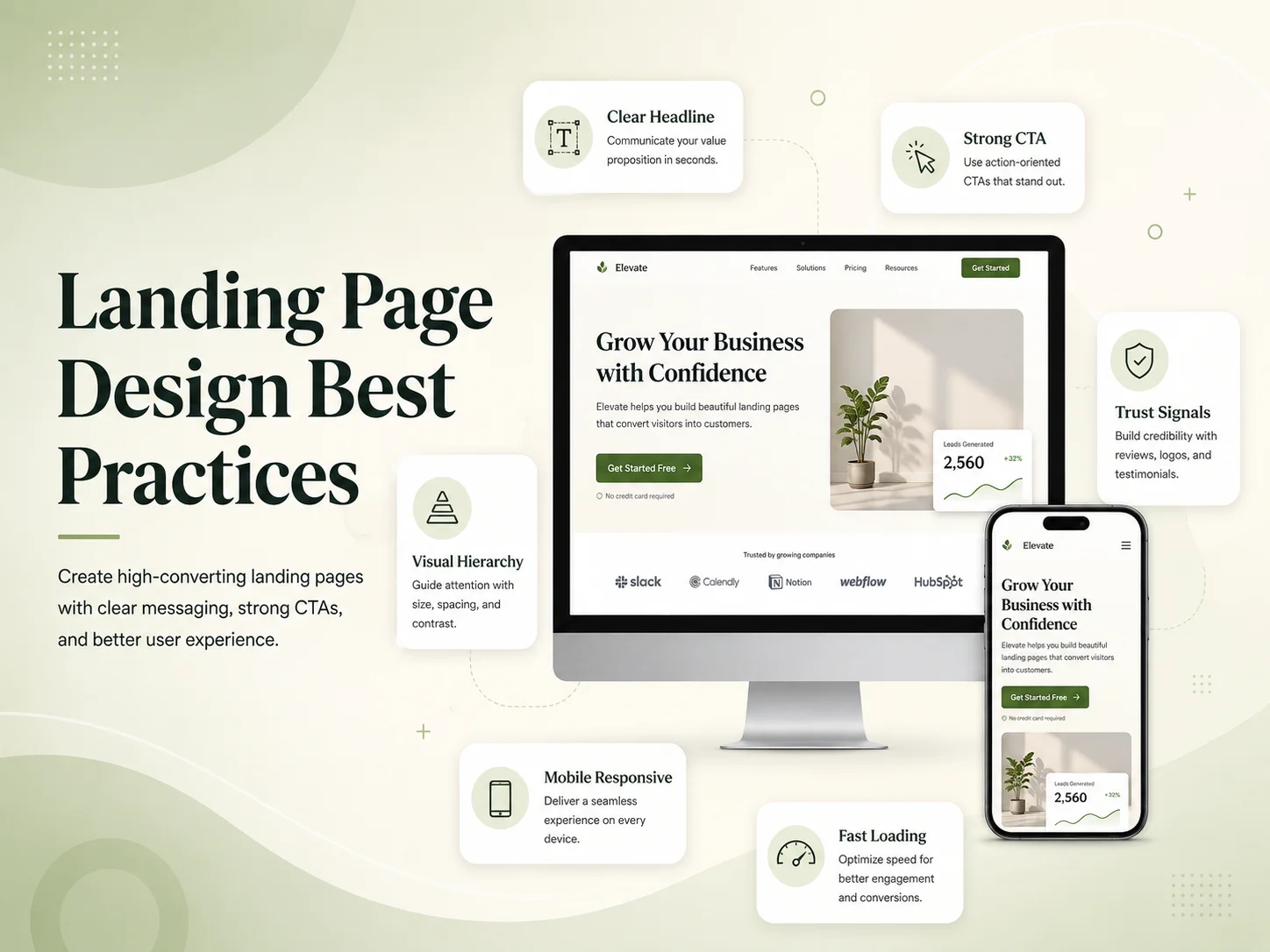
A landing page has one primary job: guide visitors toward a specific action. That action might be requesting a quote, booking a consultation, downloading a resource, starting a free trial, registering for an event, or purchasing a product.

Unlike a general website page, a landing page should remove unnecessary distractions and make the offer easy to understand. Strong landing page design combines clear messaging, visual hierarchy, trust, focused calls to action, responsive design, and a smooth user journey.

The goal is not to add as many sections as possible. A successful landing page gives visitors the information they need to make a decision and removes the friction that might stop them from taking the next step.

Make the Main Message Clear Immediately

The first section of a landing page should quickly explain what is being offered and why it matters. Visitors should not need to scroll through several sections before understanding the product, service, or benefit.

A strong headline normally communicates the primary value in simple language. The supporting text can provide a little more context, while the main call to action should make the desired next step obvious.

The hero section should avoid competing messages. Multiple buttons leading to unrelated actions, long paragraphs, unnecessary menus, and too many visual elements can make it harder for visitors to understand what deserves attention.

For example, a software landing page promoting a free trial may focus on one primary action such as “Start Free Trial.” A service business may use “Request a Quote” or “Book a Consultation.” Secondary actions can exist, but they should not compete visually with the main conversion goal.

Build the Page Around Visitor Questions

After the opening section, the page should answer the questions a potential customer is likely to have before taking action. What problem does the offer solve? How does it work? Why should the visitor trust the business? What makes the solution different? What happens after submitting the form or purchasing?

The order of these answers matters. Visitors usually need to understand the benefit before reading technical details. A landing page should therefore move from the main value proposition into supporting benefits, proof, important features, and then the final decision.

Long pages are not automatically bad. Some offers require more explanation than others. A simple event registration page may need relatively little content, while a high-value B2B service or SaaS product may require testimonials, use cases, features, pricing information, FAQs, and detailed proof before visitors feel ready to act.

The key is relevance. Every section should help the visitor understand the offer or become more confident about taking action. If a section does neither, it may not belong on the landing page.

Use Visual Hierarchy to Guide Attention

Good landing page design makes the most important information visually obvious. Headline size, spacing, contrast, button styling, images, and section structure should guide the visitor through the page naturally.

Primary calls to action should use a consistent visual style throughout the page. If the main button changes color, wording, or purpose repeatedly, visitors may become less certain about what will happen after clicking it.

Spacing is also important. Crowded landing pages can make every element feel equally important. Giving headlines, benefits, testimonials, and calls to action enough breathing room creates clearer separation and makes the page easier to scan.

  • Use one clear primary conversion goal
  • Keep headlines specific and easy to understand
  • Use consistent CTA wording and design
  • Break long content into readable sections
  • Keep forms focused on necessary information
  • Use strong spacing and visual hierarchy
  • Make mobile layouts easy to scan and use

Reduce Friction Around Forms and Calls to Action

Many landing pages lose conversions at the point where visitors are asked to submit information. Forms should request only what the business genuinely needs at that stage.

A person requesting a simple consultation may not need to provide ten different details before speaking with the company. Additional information can often be collected later. Shorter forms are not always automatically better, but every field should have a reason to exist.

Button text should also explain the action. Generic wording such as “Submit” provides less context than “Request a Quote,” “Start Your Free Trial,” or “Book a Consultation.” Visitors should know what they are agreeing to before clicking.

Trust becomes especially important near conversion points. Relevant testimonials, customer logos, case studies, guarantees, privacy information, certifications, or clear contact details can reduce uncertainty when visitors are deciding whether to provide personal information or make a purchase.

Improve Your Landing Page Conversion

Design for Mobile Visitors and Fast Loading

A landing page may receive a large percentage of its visitors from mobile devices, particularly when traffic comes from social media, paid advertising, email campaigns, or search. The mobile version therefore needs the same level of attention as desktop design.

Headlines should remain readable without becoming excessively large, buttons should be comfortable to tap, forms should be easy to complete, and important content should not require horizontal scrolling or complex interactions.

Page speed can also affect the experience. Large background videos, oversized images, unnecessary animations, multiple tracking scripts, and third-party widgets can make a landing page slow. These elements should be included only when their value justifies the performance cost.

The first visible section deserves particular attention because it shapes the visitor’s initial impression. Important text and calls to action should appear quickly instead of waiting behind unnecessary loading effects.

Test the Page Instead of Relying Only on Design Opinions

A landing page can look excellent and still underperform. Analytics and conversion data can reveal whether visitors actually respond to the design as expected.

Businesses can compare different headlines, calls to action, form lengths, social proof, content order, or page layouts to understand what improves results. Changes should be tested carefully instead of modifying several important elements at once and then guessing which change made the difference.

Visitor behavior can also reveal where the problem exists. If users leave immediately, the main message may be unclear or the traffic may not match the offer. If visitors scroll through the page but rarely submit the form, the offer, trust signals, or conversion step may need improvement.

Encoder IT Limited provides landing page UI/UX design, website development, conversion-focused redesign, responsive frontend development, WordPress development, and custom web solutions for businesses that want to turn more website visitors into enquiries and customers.

The strongest landing pages are usually focused rather than complicated. A clear offer, strong visual hierarchy, useful supporting information, simple forms, trustworthy design, and an obvious next action can create a much more effective conversion path than a page filled with unnecessary sections and distractions.

How to Design a User-Friendly Mobile App

A user-friendly mobile app should make important tasks feel simple from the first interaction. Users should not need instructions to understand where to go, what a button does, or how to complete the app’s main purpose.

Good mobile app UI/UX design combines clear navigation, readable content, simple workflows, responsive performance, useful feedback, and consistent interface patterns. The goal is not to remove every advanced feature, but to organize complexity so users only deal with the information and actions they need at each stage.

Whether the application is built for e-commerce, booking, SaaS, healthcare, business management, customer service, or another purpose, usability should begin with understanding what users actually want to accomplish.

Start With the Most Important User Journeys

Before designing individual screens, identify the main tasks users need to complete. A shopping app may focus on finding products, checking details, adding items to the cart, and purchasing. A service application may prioritize finding a service, selecting availability, booking, and managing appointments.

These flows should be mapped before adding secondary features. If an important action requires too many steps, it should be simplified during planning rather than after development.

Designers should also consider different user roles. A customer, employee, manager, and administrator may need completely different information. Showing everyone the same dashboard or navigation can make the interface unnecessarily complicated.

The first version of the app should focus heavily on frequent actions. Features that users rarely need can remain accessible without competing visually with the main workflow.

A user-friendly mobile app does not make users think about how the interface works. It gives them clear choices, predictable feedback, and the shortest practical path from what they want to do to a successful result.

Keep Navigation Clear and Predictable

Navigation should help users understand where they are and how to reach the next important area. If the application has only a few primary sections, bottom navigation can provide fast access. Other apps may work better with tabs, search, dashboards, or a carefully organized menu.

The exact navigation pattern matters less than consistency. If account settings appear under a profile icon in one part of the app, users should not need to look for them somewhere completely different on another screen.

Labels should also be familiar. Clear terms such as “Orders,” “Messages,” “Bookings,” or “Profile” are usually more useful than creative names that force users to guess what a section contains.

Buttons and interactive controls should be comfortable to use on touch screens. Important actions need enough spacing, and destructive actions such as deleting an account or cancelling an order should be clearly separated from normal navigation.

Make Forms and Actions Easier to Complete

Forms are one of the places where mobile UX can quickly become frustrating. Typing on a smartphone takes more effort than using a desktop keyboard, so businesses should avoid asking for information that is not necessary.

Use the correct input type where possible, keep labels visible, explain validation errors clearly, and reuse information that the user has already provided. If a process contains many required fields, dividing it into logical stages can be easier than displaying one extremely long form.

The same principle applies to checkout, registration, booking, and onboarding. Every additional screen or required action should have a clear reason to exist.

  • Keep forms focused on necessary information
  • Use clear labels instead of placeholder-only fields
  • Explain errors near the field that needs attention
  • Reuse saved information where appropriate
  • Provide visible confirmation after important actions
  • Avoid asking users to repeat completed steps

Users should also receive immediate feedback after interacting with the app. If they tap “Save,” “Pay,” “Book,” or “Send,” the interface should clearly indicate that the action is being processed and whether it succeeded.

A lack of feedback can cause users to tap buttons repeatedly, submit duplicate requests, or assume the application has stopped working.

Design a Better Mobile App Experience

Use Visual Design to Improve Understanding

A clean visual interface helps users distinguish important information from secondary details. Typography, spacing, colors, icons, buttons, and cards should follow a consistent design system rather than changing from screen to screen.

Visual hierarchy is especially important on small screens. A screen containing several equally prominent buttons, headings, banners, and cards can feel overwhelming. The interface should make the primary action obvious while allowing secondary options to remain available without competing for attention.

Readable text is equally important. Very small fonts, weak contrast, and long paragraphs can make an otherwise attractive application uncomfortable to use. Content should be written and arranged for mobile consumption rather than copied directly from desktop software.

Consistency also improves learning. Once users understand how one form, modal, filter, or navigation pattern works, similar components should behave in the same way elsewhere in the application.

Performance and Error Handling Are Part of UX

A beautiful interface does not feel user-friendly if every screen takes too long to load. Mobile apps frequently depend on backend APIs, images, databases, notifications, and external services, so performance needs to be considered during both design and development.

Only the information required for the current screen should be loaded when possible. Images should be optimized, API requests should be efficient, and longer operations should have clear loading states.

Network failures also need thoughtful design. Mobile users can lose connectivity or move between Wi-Fi and cellular networks. Instead of displaying a technical error or empty screen, the app should explain what happened and offer a useful next step such as retrying.

Empty states deserve similar attention. A new user with no orders, tasks, messages, or projects should see helpful guidance rather than an unexplained blank screen. A short message and relevant action can turn an empty area into part of onboarding.

Improve the App With Real User Feedback

User-friendly design is not finished when the app launches. Real users may interact with the product differently from what the design team expected. Analytics, support requests, usability testing, reviews, and direct feedback can reveal where people become confused or abandon important workflows.

If users repeatedly stop halfway through registration, the process may be asking for too much information. If an important feature receives little usage, it may be difficult to discover. If support teams repeatedly explain the same action, the interface itself may need to become clearer.

Encoder IT Limited provides UI/UX design and mobile app development for Flutter, React Native, native Android, and native iOS applications. Our work can include user-flow planning, wireframes, mobile interface design, design systems, prototyping, frontend development, and usability improvements.

A user-friendly mobile app is created by reducing unnecessary effort throughout the experience. Clear navigation, focused workflows, simple forms, consistent design, fast performance, useful feedback, and continuous improvement help users accomplish what they came to do without fighting the interface.

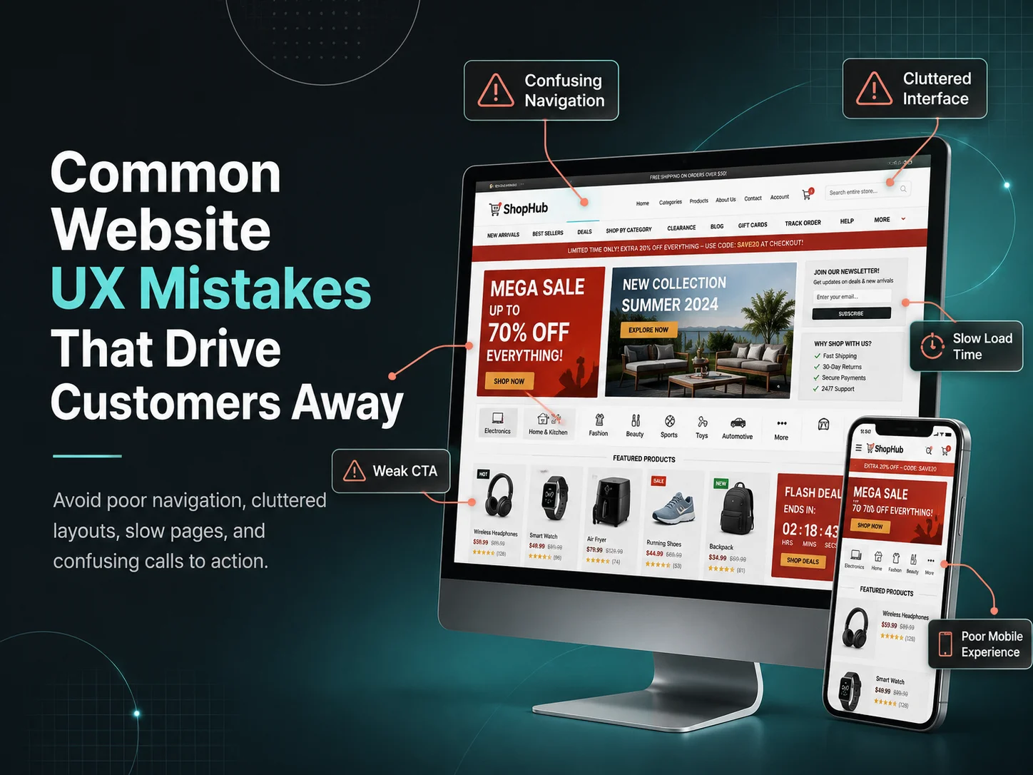
Common Website UX Mistakes That Drive Customers Away

A website can look modern and still provide a frustrating experience. Visitors care about how quickly they can understand the business, find information, complete an action, and move through the website without confusion.

When the user experience is poor, customers may leave before requesting a quote, booking a service, completing checkout, or contacting the company. Many of these problems come from small UX decisions that gradually create unnecessary friction.

Improving website UX does not always require a complete redesign. Identifying the areas where visitors become confused, slowed down, or uncertain can often reveal practical improvements that make the website easier to use and more effective for the business.

Website UX Mistakes That Commonly Reduce Engagement

  1. 1. Making Navigation Too Complicated

    Visitors should not need to study the navigation menu to understand where information is located. Too many menu items, unclear labels, deeply nested pages, or several links leading to similar content can make even a small website feel complicated.

    Navigation should prioritize the pages customers are most likely to need, such as services, products, pricing, company information, resources, and contact options. Secondary content can still remain available without competing with primary destinations.

  2. 2. Hiding the Main Call to Action

    A visitor may understand the service and be ready to take the next step but still leave because the website does not make that action obvious. Important calls to action such as requesting a quote, booking a consultation, purchasing a product, or contacting the company should appear naturally throughout relevant pages.

    The opposite problem can also occur. If every section contains several brightly styled buttons asking visitors to do different things, the page can become visually confusing. A clear primary action is usually more effective than several competing ones.

  3. 3. Using Too Much Content Without Clear Structure

    Detailed content can be useful, especially when customers need information before making a decision. The problem is not necessarily the amount of text—it is presenting large amounts of information without headings, spacing, visual hierarchy, or clear priorities.

    Visitors often scan a page before reading closely. Headings should explain what each section covers, paragraphs should remain readable, and important information should stand out. Long pages can work very well when they are organized around the questions users actually have.

  4. 4. Designing for Desktop First and Treating Mobile as an Adjustment

    A website may look excellent on a large screen while becoming difficult to use on a smartphone. Small buttons, oversized headings, awkward forms, wide tables, crowded menus, and popups that cover most of the screen can quickly drive mobile visitors away.

    Responsive design should consider how people interact with the website on smaller screens. Important information should remain easy to reach, navigation should stay simple, and users should be able to complete key actions without zooming or horizontal scrolling.

  5. 5. Making Forms Longer Than Necessary

    Every additional form field asks the visitor for more time and information. For a simple enquiry, requesting unnecessary company details, multiple addresses, detailed project information, and several optional fields can discourage users from completing the form.

    Ask only for information required at that stage. More detailed information can often be collected after the initial contact. Clear labels and specific validation messages also make forms easier to complete when an error occurs.

  6. 6. Letting the Website Feel Slow

    Website speed is part of the user experience. Visitors notice slow-loading pages, delayed menus, images appearing late, or buttons that do not respond quickly. Performance issues can become particularly frustrating when users move between several product or service pages.

    Large images, unnecessary scripts, excessive plugins, heavy animations, and third-party tools can all contribute to slower experiences. Performance should therefore be considered as part of UX rather than only as a technical task.

  7. 7. Using Popups and Interruptions Too Aggressively

    Popups can support marketing when used carefully, but showing several interruptions immediately after someone arrives can make the website difficult to explore. Cookie notices, newsletter forms, chat windows, promotional banners, notification requests, and discount popups can quickly compete for the same screen space.

    Visitors should first have an opportunity to understand the website. Promotional elements should support the journey rather than blocking the content the visitor came to see.

  8. 8. Providing Weak Feedback After User Actions

    When someone submits a form, adds a product to the cart, completes a payment, uploads a file, or changes account information, the website should clearly show what happened.

    If nothing changes visually, users may click again or assume the action failed. Clear success messages, loading states, error explanations, and confirmation screens give users confidence that the website is responding correctly.

Trust Problems Can Also Become UX Problems

User experience is closely connected with trust. A visitor may hesitate when contact details are difficult to find, product information is incomplete, pricing is unclear, or important policies are hidden.

Broken links, inconsistent branding, outdated information, low-quality images, missing security indicators, or poorly written content can also make the website feel less reliable. Even when the underlying business is trustworthy, the interface may communicate the opposite impression.

For e-commerce websites, shipping, returns, payment methods, stock information, and delivery expectations should be easy to understand. For service businesses, customers may look for testimonials, case studies, previous work, company information, or a clear explanation of what happens after they submit an enquiry.

  • Keep navigation easy to understand
  • Use one clear primary action per important section
  • Make content easy to scan
  • Design carefully for mobile devices
  • Reduce unnecessary form fields
  • Provide clear loading, success, and error states
  • Keep promotional interruptions under control
  • Make trust information easy to find

Improve Your Website User Experience

Use Real Visitor Behavior to Find UX Problems

Businesses should not rely only on internal opinions when evaluating website UX. Analytics can show which pages receive traffic, where users leave, and whether important journeys such as enquiry forms or checkout are being completed.

Customer support questions can also reveal usability problems. If visitors repeatedly ask where to find pricing, how to book, how shipping works, or where to manage an account, the website may not be communicating that information clearly enough.

Usability testing can provide even more direct insight. Watching someone unfamiliar with the website attempt a few important tasks can reveal problems that are difficult for designers or business owners to notice because they already know how the site works.

Fix Friction Before Adding More Features

When a website underperforms, businesses sometimes respond by adding more sections, widgets, animations, popups, or features. This can make the underlying UX problems worse.

Encoder IT Limited provides UI/UX design, website redesign, responsive development, conversion-focused improvements, WordPress development, e-commerce UX, and custom website development for businesses that want a clearer and more effective digital experience.

Good website UX is often about removing friction rather than adding complexity. When visitors can understand the business quickly, navigate confidently, find trustworthy information, and complete important actions without unnecessary effort, the website has a much better chance of turning interest into genuine customer engagement.

Why UI/UX Design Matters for Business Growth

A website or application is often one of the main places where customers interact with a business. They may discover a service, compare products, request a quote, create an account, make a purchase, or manage an ongoing relationship through a digital interface. If that experience is confusing or difficult, the business can lose opportunities even when its products or services are strong.

UI/UX design matters for business growth because it affects how easily customers understand an offer, trust the company, complete important actions, and return in the future. Good design is not only about making screens look attractive. It helps connect business goals with the needs of the people actually using the website, mobile app, SaaS platform, or e-commerce store.

Better User Experience Can Create More Conversion Opportunities

Every website or application has important actions it wants users to complete. A service business may want visitors to request a consultation. An e-commerce store needs customers to complete purchases. A SaaS company may want users to start a trial, complete onboarding, and continue using the product.

UX design examines the steps between arriving and completing those actions. Complicated navigation, unclear pricing, long forms, weak calls to action, confusing checkout processes, or missing information can create friction throughout the journey.

Improving the experience does not mean pushing visitors more aggressively toward a button. It means making the decision easier. Clear information, understandable navigation, simple forms, visible next steps, and useful feedback can help customers move forward with greater confidence.

UI design supports that process by creating visual hierarchy. Important actions should stand out, related information should feel connected, and typography, spacing, colors, buttons, and other interface elements should guide attention rather than compete for it.

UIUX-banner-3

Professional Design Builds Trust Before Customers Contact You

Customers begin forming impressions about a business almost immediately after visiting its digital platforms. Consistent branding, readable typography, quality imagery, organized content, and a well-structured interface can make a company appear more established and dependable.

Trust can weaken when pages contain broken layouts, outdated information, inconsistent buttons, poor mobile responsiveness, confusing forms, or important details that are difficult to find. Visitors may not consciously identify every design problem, but the overall experience can influence whether they feel comfortable sharing personal information, making a payment, or contacting the company.

Good UX also makes trust-related information easier to access. Testimonials, case studies, policies, pricing information, contact details, product specifications, delivery information, or security-related messages should appear where customers naturally need them.

For businesses selling higher-value services or products, these details can be especially important because customers may spend more time evaluating alternatives before making a decision.

Strong UI/UX Helps Customers Stay Engaged

Business growth is not only about acquiring new users. Keeping existing customers engaged can be equally important. A customer who already understands a product should not need to struggle through the interface every time they return.

For mobile apps and SaaS products, navigation, onboarding, dashboards, forms, notifications, account settings, and recurring workflows all influence continued usage. If routine tasks require too many steps or important features are difficult to discover, users may gradually stop using the product.

E-commerce businesses face a similar challenge. Customers may return when it is easy to search, reorder products, manage accounts, review previous purchases, track deliveries, and complete checkout. A smoother experience can reduce the effort required to buy again.

  • Clear navigation makes important information easier to find
  • Simple workflows reduce unnecessary user effort
  • Consistent interfaces make products easier to learn
  • Responsive design improves the experience across devices
  • Useful feedback gives users confidence after actions
  • Accessible design helps serve a wider range of customers
  • Better onboarding can help users reach value sooner

Good UX Can Also Improve Business Operations

UI/UX design is often discussed only from the customer’s perspective, but internal software also affects business performance. Employees may spend hours every day using dashboards, CRM systems, administration panels, inventory tools, scheduling applications, or custom business platforms.

Poorly designed internal systems can create unnecessary clicks, repeated data entry, confusing processes, and avoidable mistakes. When frequent workflows are simplified, employees can complete tasks more efficiently and require less training to understand the software.

Role-based interfaces can make this even more effective. A manager may need reports and approvals, while an employee may primarily need assigned tasks and schedules. Giving each user the information relevant to their responsibilities can make complex business software feel significantly simpler.

Good UX can therefore support growth from both directions: customers receive a smoother external experience while employees work through more efficient internal processes.

Improve Your Digital Product Experience

UI/UX Makes Products Easier to Improve as the Business Grows

Businesses change over time. Websites gain new services, e-commerce stores add product categories, and SaaS applications introduce more modules and user roles. Without a clear design system and UX structure, each new feature can make the product more inconsistent and difficult to navigate.

A scalable design system creates reusable patterns for buttons, forms, tables, navigation, cards, colors, typography, spacing, alerts, and other interface components. This helps designers and developers add new functionality while maintaining a familiar experience for users.

Businesses should also use real customer behavior to guide future improvements. Analytics can reveal where users leave a journey, which features receive attention, and where conversion problems occur. Customer interviews, support requests, usability testing, and sales feedback can explain why those problems are happening.

Instead of redesigning a product based only on trends or personal preferences, teams can focus on the areas where improved usability is most likely to create meaningful business value.

Encoder IT Limited provides UI/UX design and development for business websites, mobile applications, SaaS products, e-commerce stores, dashboards, and custom web applications. Our work can include user-flow planning, wireframes, responsive interface design, design systems, frontend development, and conversion-focused UX improvements.

UI/UX design supports business growth by reducing friction between customers and the actions that matter. When people can understand a business quickly, navigate confidently, complete tasks easily, and enjoy a consistent experience, digital products become more effective tools for attracting customers, supporting users, and building longer-term relationships.