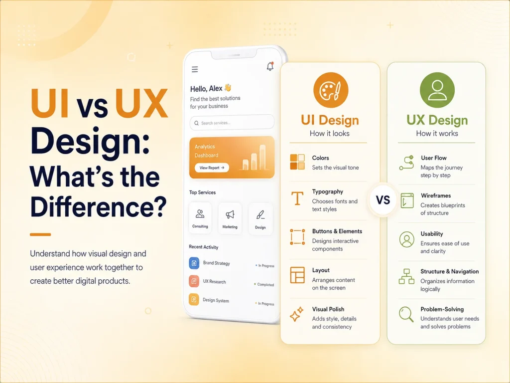
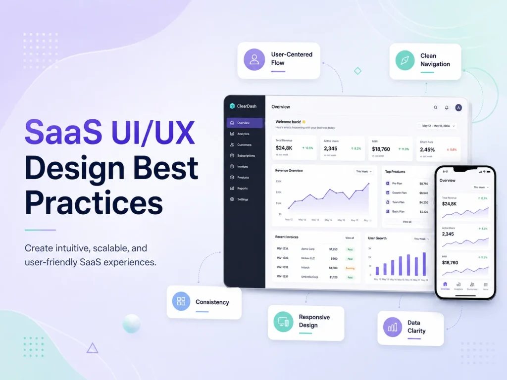
A website can look modern and still provide a frustrating experience. Visitors care about how quickly they can understand the business, find information, complete an action, and move through the website without confusion.
When the user experience is poor, customers may leave before requesting a quote, booking a service, completing checkout, or contacting the company. Many of these problems come from small UX decisions that gradually create unnecessary friction.
Improving website UX does not always require a complete redesign. Identifying the areas where visitors become confused, slowed down, or uncertain can often reveal practical improvements that make the website easier to use and more effective for the business.
Website UX Mistakes That Commonly Reduce Engagement
- 1. Making Navigation Too Complicated
Visitors should not need to study the navigation menu to understand where information is located. Too many menu items, unclear labels, deeply nested pages, or several links leading to similar content can make even a small website feel complicated.
Navigation should prioritize the pages customers are most likely to need, such as services, products, pricing, company information, resources, and contact options. Secondary content can still remain available without competing with primary destinations.
- 2. Hiding the Main Call to Action
A visitor may understand the service and be ready to take the next step but still leave because the website does not make that action obvious. Important calls to action such as requesting a quote, booking a consultation, purchasing a product, or contacting the company should appear naturally throughout relevant pages.
The opposite problem can also occur. If every section contains several brightly styled buttons asking visitors to do different things, the page can become visually confusing. A clear primary action is usually more effective than several competing ones.
- 3. Using Too Much Content Without Clear Structure
Detailed content can be useful, especially when customers need information before making a decision. The problem is not necessarily the amount of text—it is presenting large amounts of information without headings, spacing, visual hierarchy, or clear priorities.
Visitors often scan a page before reading closely. Headings should explain what each section covers, paragraphs should remain readable, and important information should stand out. Long pages can work very well when they are organized around the questions users actually have.
- 4. Designing for Desktop First and Treating Mobile as an Adjustment
A website may look excellent on a large screen while becoming difficult to use on a smartphone. Small buttons, oversized headings, awkward forms, wide tables, crowded menus, and popups that cover most of the screen can quickly drive mobile visitors away.
Responsive design should consider how people interact with the website on smaller screens. Important information should remain easy to reach, navigation should stay simple, and users should be able to complete key actions without zooming or horizontal scrolling.
- 5. Making Forms Longer Than Necessary
Every additional form field asks the visitor for more time and information. For a simple enquiry, requesting unnecessary company details, multiple addresses, detailed project information, and several optional fields can discourage users from completing the form.
Ask only for information required at that stage. More detailed information can often be collected after the initial contact. Clear labels and specific validation messages also make forms easier to complete when an error occurs.
- 6. Letting the Website Feel Slow
Website speed is part of the user experience. Visitors notice slow-loading pages, delayed menus, images appearing late, or buttons that do not respond quickly. Performance issues can become particularly frustrating when users move between several product or service pages.
Large images, unnecessary scripts, excessive plugins, heavy animations, and third-party tools can all contribute to slower experiences. Performance should therefore be considered as part of UX rather than only as a technical task.
- 7. Using Popups and Interruptions Too Aggressively
Popups can support marketing when used carefully, but showing several interruptions immediately after someone arrives can make the website difficult to explore. Cookie notices, newsletter forms, chat windows, promotional banners, notification requests, and discount popups can quickly compete for the same screen space.
Visitors should first have an opportunity to understand the website. Promotional elements should support the journey rather than blocking the content the visitor came to see.
- 8. Providing Weak Feedback After User Actions
When someone submits a form, adds a product to the cart, completes a payment, uploads a file, or changes account information, the website should clearly show what happened.
If nothing changes visually, users may click again or assume the action failed. Clear success messages, loading states, error explanations, and confirmation screens give users confidence that the website is responding correctly.
Trust Problems Can Also Become UX Problems
User experience is closely connected with trust. A visitor may hesitate when contact details are difficult to find, product information is incomplete, pricing is unclear, or important policies are hidden.
Broken links, inconsistent branding, outdated information, low-quality images, missing security indicators, or poorly written content can also make the website feel less reliable. Even when the underlying business is trustworthy, the interface may communicate the opposite impression.
For e-commerce websites, shipping, returns, payment methods, stock information, and delivery expectations should be easy to understand. For service businesses, customers may look for testimonials, case studies, previous work, company information, or a clear explanation of what happens after they submit an enquiry.
- Keep navigation easy to understand
- Use one clear primary action per important section
- Make content easy to scan
- Design carefully for mobile devices
- Reduce unnecessary form fields
- Provide clear loading, success, and error states
- Keep promotional interruptions under control
- Make trust information easy to find
Improve Your Website User Experience
Use Real Visitor Behavior to Find UX Problems
Businesses should not rely only on internal opinions when evaluating website UX. Analytics can show which pages receive traffic, where users leave, and whether important journeys such as enquiry forms or checkout are being completed.
Customer support questions can also reveal usability problems. If visitors repeatedly ask where to find pricing, how to book, how shipping works, or where to manage an account, the website may not be communicating that information clearly enough.
Usability testing can provide even more direct insight. Watching someone unfamiliar with the website attempt a few important tasks can reveal problems that are difficult for designers or business owners to notice because they already know how the site works.
Fix Friction Before Adding More Features
When a website underperforms, businesses sometimes respond by adding more sections, widgets, animations, popups, or features. This can make the underlying UX problems worse.
Encoder IT Limited provides UI/UX design, website redesign, responsive development, conversion-focused improvements, WordPress development, e-commerce UX, and custom website development for businesses that want a clearer and more effective digital experience.
Good website UX is often about removing friction rather than adding complexity. When visitors can understand the business quickly, navigate confidently, find trustworthy information, and complete important actions without unnecessary effort, the website has a much better chance of turning interest into genuine customer engagement.