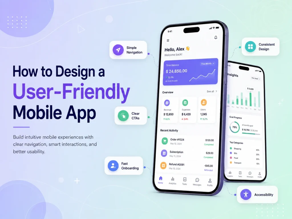
A user-friendly mobile app should make important tasks feel simple from the first interaction. Users should not need instructions to understand where to go, what a button does, or how to complete the app’s main purpose.
Good mobile app UI/UX design combines clear navigation, readable content, simple workflows, responsive performance, useful feedback, and consistent interface patterns. The goal is not to remove every advanced feature, but to organize complexity so users only deal with the information and actions they need at each stage.
Whether the application is built for e-commerce, booking, SaaS, healthcare, business management, customer service, or another purpose, usability should begin with understanding what users actually want to accomplish.
Start With the Most Important User Journeys
Before designing individual screens, identify the main tasks users need to complete. A shopping app may focus on finding products, checking details, adding items to the cart, and purchasing. A service application may prioritize finding a service, selecting availability, booking, and managing appointments.
These flows should be mapped before adding secondary features. If an important action requires too many steps, it should be simplified during planning rather than after development.
Designers should also consider different user roles. A customer, employee, manager, and administrator may need completely different information. Showing everyone the same dashboard or navigation can make the interface unnecessarily complicated.
The first version of the app should focus heavily on frequent actions. Features that users rarely need can remain accessible without competing visually with the main workflow.
A user-friendly mobile app does not make users think about how the interface works. It gives them clear choices, predictable feedback, and the shortest practical path from what they want to do to a successful result.
Keep Navigation Clear and Predictable
Navigation should help users understand where they are and how to reach the next important area. If the application has only a few primary sections, bottom navigation can provide fast access. Other apps may work better with tabs, search, dashboards, or a carefully organized menu.
The exact navigation pattern matters less than consistency. If account settings appear under a profile icon in one part of the app, users should not need to look for them somewhere completely different on another screen.
Labels should also be familiar. Clear terms such as “Orders,” “Messages,” “Bookings,” or “Profile” are usually more useful than creative names that force users to guess what a section contains.
Buttons and interactive controls should be comfortable to use on touch screens. Important actions need enough spacing, and destructive actions such as deleting an account or cancelling an order should be clearly separated from normal navigation.
Forms are one of the places where mobile UX can quickly become frustrating. Typing on a smartphone takes more effort than using a desktop keyboard, so businesses should avoid asking for information that is not necessary.
Use the correct input type where possible, keep labels visible, explain validation errors clearly, and reuse information that the user has already provided. If a process contains many required fields, dividing it into logical stages can be easier than displaying one extremely long form.
The same principle applies to checkout, registration, booking, and onboarding. Every additional screen or required action should have a clear reason to exist.
- Keep forms focused on necessary information
- Use clear labels instead of placeholder-only fields
- Explain errors near the field that needs attention
- Reuse saved information where appropriate
- Provide visible confirmation after important actions
- Avoid asking users to repeat completed steps
Users should also receive immediate feedback after interacting with the app. If they tap “Save,” “Pay,” “Book,” or “Send,” the interface should clearly indicate that the action is being processed and whether it succeeded.
A lack of feedback can cause users to tap buttons repeatedly, submit duplicate requests, or assume the application has stopped working.
Design a Better Mobile App Experience
Use Visual Design to Improve Understanding
A clean visual interface helps users distinguish important information from secondary details. Typography, spacing, colors, icons, buttons, and cards should follow a consistent design system rather than changing from screen to screen.
Visual hierarchy is especially important on small screens. A screen containing several equally prominent buttons, headings, banners, and cards can feel overwhelming. The interface should make the primary action obvious while allowing secondary options to remain available without competing for attention.
Readable text is equally important. Very small fonts, weak contrast, and long paragraphs can make an otherwise attractive application uncomfortable to use. Content should be written and arranged for mobile consumption rather than copied directly from desktop software.
Consistency also improves learning. Once users understand how one form, modal, filter, or navigation pattern works, similar components should behave in the same way elsewhere in the application.
A beautiful interface does not feel user-friendly if every screen takes too long to load. Mobile apps frequently depend on backend APIs, images, databases, notifications, and external services, so performance needs to be considered during both design and development.
Only the information required for the current screen should be loaded when possible. Images should be optimized, API requests should be efficient, and longer operations should have clear loading states.
Network failures also need thoughtful design. Mobile users can lose connectivity or move between Wi-Fi and cellular networks. Instead of displaying a technical error or empty screen, the app should explain what happened and offer a useful next step such as retrying.
Empty states deserve similar attention. A new user with no orders, tasks, messages, or projects should see helpful guidance rather than an unexplained blank screen. A short message and relevant action can turn an empty area into part of onboarding.
Improve the App With Real User Feedback
User-friendly design is not finished when the app launches. Real users may interact with the product differently from what the design team expected. Analytics, support requests, usability testing, reviews, and direct feedback can reveal where people become confused or abandon important workflows.
If users repeatedly stop halfway through registration, the process may be asking for too much information. If an important feature receives little usage, it may be difficult to discover. If support teams repeatedly explain the same action, the interface itself may need to become clearer.
Encoder IT Limited provides UI/UX design and mobile app development for Flutter, React Native, native Android, and native iOS applications. Our work can include user-flow planning, wireframes, mobile interface design, design systems, prototyping, frontend development, and usability improvements.
A user-friendly mobile app is created by reducing unnecessary effort throughout the experience. Clear navigation, focused workflows, simple forms, consistent design, fast performance, useful feedback, and continuous improvement help users accomplish what they came to do without fighting the interface.