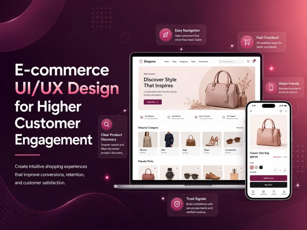
An e-commerce website may attract visitors through search, advertising, social media, or existing customers, but the shopping experience determines whether those visitors continue exploring the store. Confusing navigation, weak product information, slow pages, difficult filters, or a complicated checkout can cause customers to leave even when they are interested in the products.
E-commerce UI/UX design focuses on making the complete shopping journey easier—from discovering a product and comparing options to adding it to the cart, completing payment, and returning for another purchase. Higher engagement does not simply mean keeping users on the website longer. It means helping them interact with products, find useful information, and move confidently toward a buying decision.
Make Product Discovery Feel Effortless
Customers should be able to understand the store quickly. Categories, navigation, search, and filters need to reflect how customers think about products rather than how the business organizes inventory internally.
A small store may work well with a simple category structure, while a larger catalog may need filtering by price, size, color, brand, availability, rating, material, or other product-specific attributes. The objective is to reduce the number of irrelevant products customers need to browse before reaching something suitable.
Search deserves particular attention. Customers may use different words from those used in product titles, make spelling mistakes, or search for a type of product rather than a specific item. A useful search experience should help people move forward instead of repeatedly showing empty results.
Product cards should also provide enough information for customers to decide whether opening the full product page is worthwhile. Clear images, product names, pricing, important variations, availability, ratings where appropriate, and promotional information can support faster browsing without making the listing visually crowded.
Product Pages Should Answer Buying Questions
Once someone reaches a product page, the design should reduce uncertainty. Customers cannot physically inspect the item, so images, descriptions, specifications, variations, sizing, delivery details, stock information, and return policies all contribute to the buying decision.
Visual hierarchy matters. The product name, price, variation selection, and primary purchase action should be easy to identify. Secondary information can appear lower on the page or inside clearly organized sections so customers are not presented with everything at once.
High-quality product photography can increase confidence, especially when multiple angles, close-up details, lifestyle images, or scale references help customers understand what they are purchasing. Product videos can also be useful when movement, fit, texture, or functionality is difficult to communicate through static images.
A strong e-commerce experience removes questions at the moment customers are ready to buy. Clear product information, visible pricing, simple options, trustworthy delivery details, and an obvious next action can reduce hesitation without relying on aggressive sales tactics.
Reviews and ratings can provide additional context when they are authentic and useful. Customers may learn about fit, quality, durability, or real-world use from previous buyers. The interface should make reviews easy to scan without allowing them to overwhelm the primary product information.
Reduce Friction in Cart and Checkout
Customers who add a product to the cart have already shown strong intent, so the next steps should remain simple. The cart should clearly show selected products, variations, quantities, prices, discounts, and expected totals. Customers should be able to update quantities or remove an item without confusion.
Unexpected costs are a common source of hesitation. Shipping charges, taxes, or other important costs should be communicated as clearly and as early as practical. If customers only discover significant additional charges at the final payment step, they may abandon the purchase.
Checkout forms should request only the information required to complete the order. Long account-creation processes, repeated fields, unclear validation, and unnecessary steps can make checkout feel more difficult than the purchase itself.
- Keep cart information easy to review and edit
- Show delivery and pricing information clearly
- Use simple, mobile-friendly checkout forms
- Make validation errors specific and easy to correct
- Offer appropriate payment methods for the target customers
- Give clear confirmation after a successful purchase
Customers should also understand what is happening when payment takes time. Loading states, disabled duplicate-submit actions, and clear success or failure messages can prevent uncertainty and accidental repeated payments.
Many customers browse online stores from smartphones, where limited screen space changes how they interact with navigation, filters, images, and checkout. A responsive layout should not simply shrink the desktop design.
Product galleries should remain easy to swipe through, filters should be accessible without covering the entire shopping experience unnecessarily, and buttons need enough space for comfortable touch interaction. Sticky purchase actions can be useful on longer product pages when implemented carefully, because customers do not need to scroll back to the top after reviewing details.
Mobile checkout should also minimize typing. Appropriate keyboard types, address assistance where suitable, saved customer information, clear input labels, and logical field order can make completing a purchase easier.
Performance is part of the mobile experience too. Large images, excessive scripts, marketing widgets, and poorly optimized third-party tools can make product browsing frustrating on slower connections. A visually sophisticated interface provides little value if customers spend most of their time waiting for it to respond.
Improve Your E-commerce User Experience
Engagement Continues After the First Purchase
E-commerce UX does not need to end at checkout. Order confirmation, delivery updates, account areas, wishlists, saved products, back-in-stock notifications, and relevant recommendations can make it easier for customers to return.
Personalization can be useful when it genuinely reduces effort. Showing recently viewed products, preferred categories, or relevant recommendations may help returning customers continue shopping. However, personalization should remain understandable and should not overwhelm users with constant promotional messages.
Customer support also affects engagement. Customers may have questions about delivery, sizing, returns, product compatibility, or order status. FAQs, live chat, AI-assisted support, contact options, and clear policies can help resolve uncertainty before it becomes a reason to leave.
Use Customer Behavior to Improve the Store
Good e-commerce UX should continue evolving after launch. Analytics can show which categories receive attention, where users leave the purchase journey, which filters are frequently used, and which pages create friction. Support questions, reviews, and customer feedback can explain why those behaviors are happening.
If customers repeatedly visit a product page but rarely add the item to the cart, the team may need to review pricing, product information, imagery, delivery details, or the clarity of the purchase action. If many people reach checkout but leave before paying, the issue may be related to forms, payment methods, unexpected costs, trust, or technical problems.
Encoder IT Limited provides UI/UX design and development for WooCommerce, Shopify, custom e-commerce stores, marketplaces, and other online retail platforms. Our work can include product discovery, search and filtering, product-page design, checkout UX, responsive interfaces, conversion improvements, and custom e-commerce development.
Higher customer engagement usually comes from making shopping easier rather than adding more visual effects or promotional interruptions. When customers can find products quickly, understand them clearly, trust the store, and complete checkout without unnecessary friction, they are more likely to continue browsing, complete purchases, and return in the future.