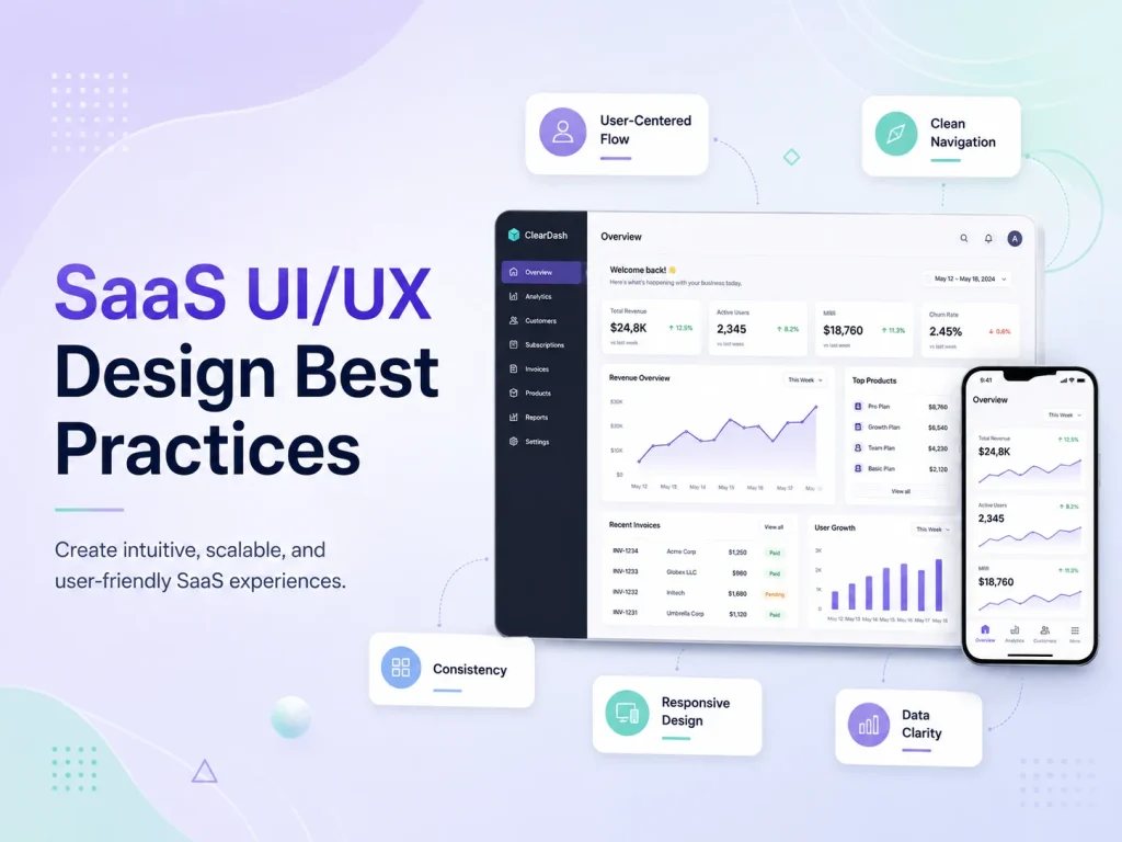
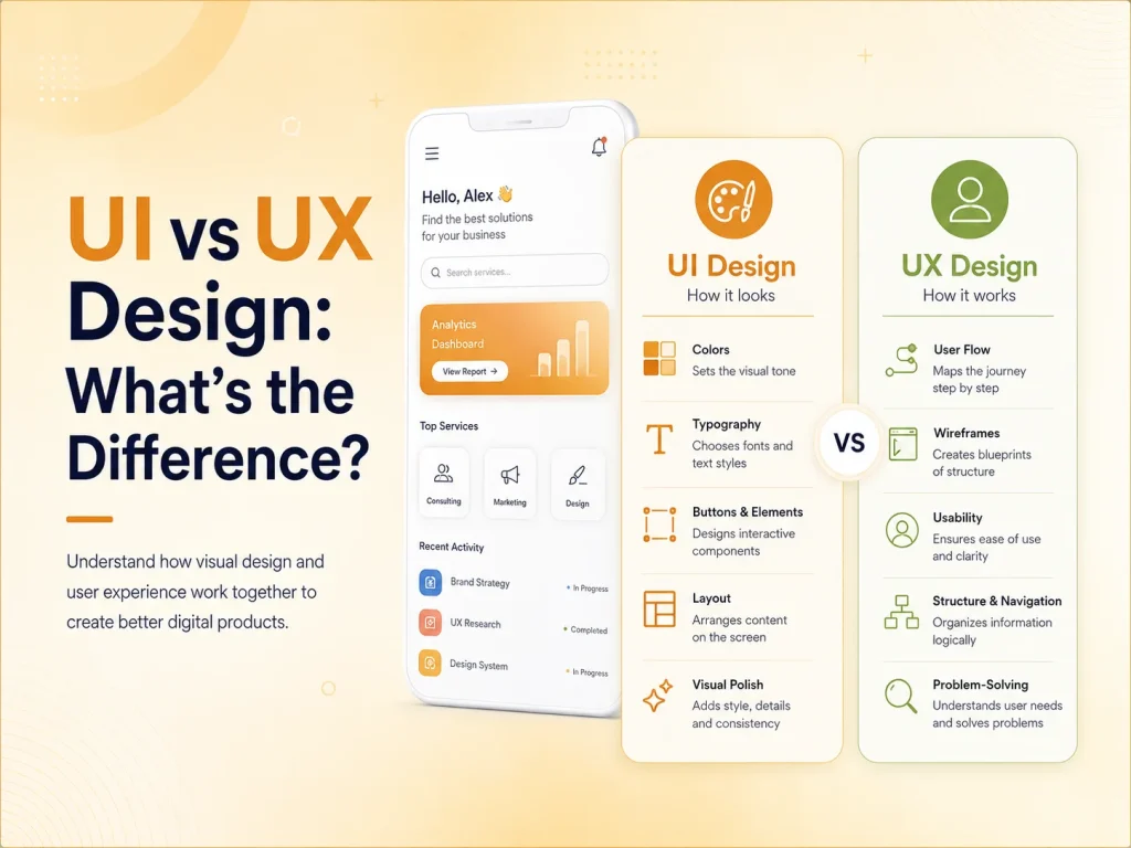
SaaS products often contain more complexity than traditional websites. Users may need to manage accounts, teams, subscriptions, projects, reports, settings, notifications, billing, and large amounts of business data from the same application. Good SaaS UI/UX design helps organize that complexity so users can understand the product quickly and complete important tasks without unnecessary friction.
The best SaaS interfaces are not simply attractive dashboards. They help new users learn the product, make frequent actions easy to reach, present information clearly, and keep the experience consistent as more features are added. Strong UI/UX can also affect activation, product adoption, customer satisfaction, and long-term retention.
Design Around User Tasks, Not Around the Feature List
A common SaaS design mistake is organizing the interface around every feature the development team has built. This can lead to large navigation menus, crowded dashboards, and screens where too many actions compete for attention.
A better approach is to understand what users actually need to accomplish. A project-management platform may have dozens of features, but a typical user may spend most of their time checking assigned work, updating task status, communicating with teammates, and reviewing deadlines. Those workflows should be easier to reach than rarely used configuration options.
User roles also matter. Administrators, managers, employees, customers, and other users may need different information. Showing every user the same dashboard can create unnecessary complexity. Role-based navigation and dashboards can surface the features that are most relevant to each person’s responsibilities.
Progressive disclosure can also help. Advanced settings do not need to appear immediately if most users rarely change them. Keeping secondary options behind clear menus or expandable areas allows the primary interface to remain focused without removing functionality.
Make Dashboards Useful, Not Just Visually Impressive
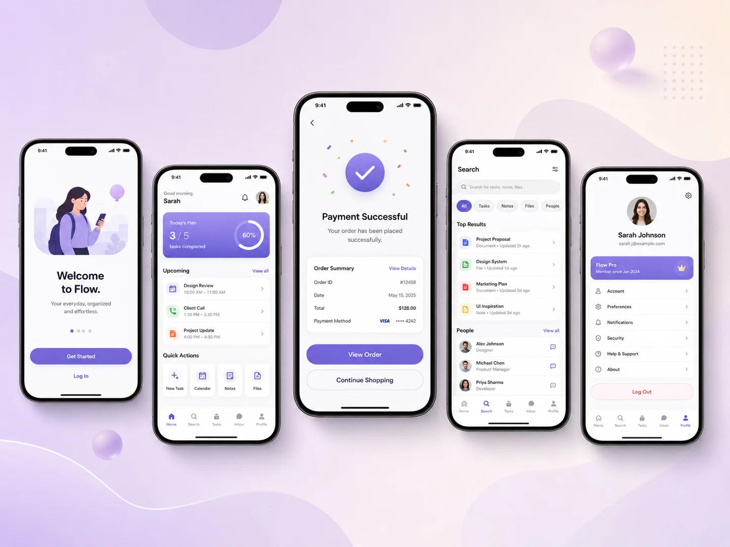
The dashboard is often the first screen users see after logging in, so it should answer useful questions immediately. What requires attention? What changed recently? What should the user do next? A dashboard filled with decorative charts but no clear purpose can look sophisticated while providing very little practical value.
Important metrics should be selected based on the user’s goals. A sales manager might need pipeline value, upcoming follow-ups, and recent activity, while an employee dashboard may focus on assigned tasks, schedules, alerts, or deadlines. Information should be prioritized rather than giving every metric equal visual weight.
Charts and tables should also be easy to interpret. Labels, units, date ranges, status indicators, and filters need to be clear. Users should not have to guess whether a number represents today, the current month, or the complete account history.
When SaaS products contain large datasets, search, filters, sorting, saved views, pagination, and bulk actions become important UX features. A well-designed table can often be more useful than an elaborate visualization when users need to find and manage specific records.
Reduce Friction in Onboarding and Everyday Workflows
New users should be able to understand how to start without reading extensive documentation. Onboarding can guide them through the first meaningful actions, such as creating a workspace, inviting a teammate, connecting an integration, creating a project, or importing data.
However, onboarding should not become a long sequence of screens users are forced to complete before seeing the product. Contextual guidance is often more useful. Empty states can explain what belongs in a section and provide a direct action such as “Create your first project” or “Invite your team.”
The same focus on simplicity should continue after onboarding. Forms should avoid asking for information that is not required. Common actions should not be hidden under several menus. Users should receive immediate feedback when they save, update, delete, or submit something.
- Keep primary navigation focused on frequent tasks
- Use clear empty states with useful next actions
- Reduce unnecessary form fields and steps
- Provide visible success, error, and loading feedback
- Use consistent labels for the same actions throughout the product
- Make search, filtering, and bulk actions easy for data-heavy screens
Error states deserve particular attention. A message such as “Something went wrong” gives users little direction. When possible, explain what failed and what they can do next. If a payment method is declined, an integration disconnects, or a file upload fails, the interface should help users recover rather than leaving them stuck.
Build Consistency With a Scalable Design System
SaaS products frequently grow over several years. New modules, roles, settings, reports, and integrations are added by different designers and developers. Without a shared design system, interfaces can gradually become inconsistent.
A design system can define typography, colors, spacing, buttons, form controls, tables, cards, dialogs, alerts, navigation, status indicators, and other reusable components. This gives users a predictable experience while making new screens faster to design and develop.
Consistency is especially important for actions. If a primary button is blue in one area, green in another, and styled like a text link somewhere else, users need to relearn the interface repeatedly. The same applies to destructive actions, status colors, filters, confirmation dialogs, and form validation.
Responsive behavior should be part of the design system too. Many SaaS products are primarily used on desktop, but users may still check reports, approve requests, respond to notifications, or manage urgent tasks from tablets and phones. Important workflows should remain usable across appropriate screen sizes even if some complex administrative views are optimized for larger displays.
Improve Your SaaS Product Experience
Use Real Product Behavior to Improve the UX
SaaS UI/UX design should continue evolving after launch. Analytics can reveal which features are heavily used, where users abandon onboarding, and which workflows take more steps than expected. Support tickets and customer interviews can reveal problems that analytics alone cannot explain.
If customers repeatedly ask how to perform the same task, the issue may not be a lack of documentation. The interface itself may need to become clearer. If users rarely discover an important feature, its navigation or positioning may need improvement. If a form has a high abandonment rate, unnecessary fields or confusing validation may be creating friction.
Teams should prioritize improvements based on user impact rather than redesigning the product simply to make it look newer. Small changes to navigation, onboarding, table controls, forms, or feedback states can sometimes improve usability more than a complete visual redesign.
Encoder IT Limited provides UI/UX design and development for SaaS platforms, dashboards, customer portals, business applications, and other complex web products. Our work can include user-flow planning, wireframes, design systems, responsive interfaces, dashboard design, frontend development, and conversion-focused UX improvements.
Effective SaaS design makes complex software feel easier than it actually is. Clear navigation, useful dashboards, focused workflows, consistent components, strong feedback, and continuous improvement help users understand the product faster and accomplish more with less effort.