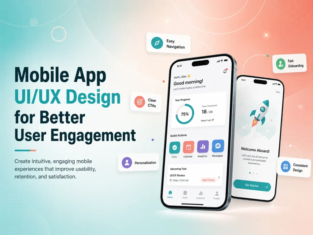
A mobile app can have useful features and strong technology but still struggle to keep users engaged if the experience feels confusing, slow, or difficult to navigate. People expect mobile applications to feel simple, responsive, and intuitive from the first interaction.
Mobile app UI/UX design focuses on making important actions easier while creating an interface that users enjoy returning to. Good design helps users understand where they are, what they can do next, and how to complete important tasks without unnecessary effort.
For businesses, better engagement can mean more completed purchases, bookings, subscriptions, messages, content interactions, or repeated use of the application. The objective is not to keep people inside the app for as long as possible, but to help them receive value quickly enough that they want to return.
Make the First Experience Easy to Understand
The first few minutes of using an app can strongly influence whether someone continues using it. New users should not be confronted with complicated navigation, long registration forms, or a large number of features before they understand the main purpose of the application.
Onboarding should focus on helping users reach their first useful result. An e-commerce app may guide users toward products and categories. A booking application can make it easy to find a service and available time. A SaaS mobile app may help users complete one important setup action rather than explaining every feature at once.
Registration should also remain as simple as the product allows. If an account is not required immediately, users may benefit from exploring some parts of the app before being asked to register. When registration is necessary, forms should avoid unnecessary fields and clearly explain validation errors.
Empty states can also improve the first experience. Instead of displaying a blank page when a new user has no projects, orders, messages, or saved items, the interface can briefly explain what belongs there and provide a useful next action.
Keep Navigation and Important Actions Simple
Users should not need to remember complicated menu structures to use an app. Primary navigation should focus on the areas people use most frequently, while secondary settings and less common features can remain available without competing for attention.
For many mobile products, bottom navigation works well for a small number of important destinations because users can reach them comfortably with one hand. Other applications may benefit from tabs, search-driven navigation, or a focused dashboard. The right pattern depends on what users actually need to do.
Important actions should also remain visually clear. Buttons need comfortable touch areas, labels should explain the action, and destructive actions such as deleting information should look different from normal navigation.
Consistency plays a major role here. If “Save” appears in different positions with different styles throughout the app, users need to think more than necessary. Reusing familiar patterns reduces that mental effort and makes the product easier to learn.
Reduce Friction in the Workflows That Matter Most
User engagement is influenced heavily by how easy it is to complete the app’s main purpose. For an e-commerce app, that might be discovering and purchasing a product. For a service app, it may be booking an appointment. For a business application, the key workflow might involve updating tasks, approving requests, or reviewing information.
These high-value journeys should contain as few unnecessary steps as possible. Long forms can be divided logically, repeated information can be avoided, and previously entered data can be reused when appropriate. Users should always understand how far they have progressed and what happens next.
- Keep forms focused on necessary information
- Use clear feedback after important actions
- Make errors easy to understand and correct
- Reduce repeated data entry
- Keep primary actions easy to reach
- Preserve user progress where practical
Feedback is especially important on mobile because users need confirmation that the app recognized their action. Loading indicators, success messages, error states, disabled buttons, and progress indicators help users understand what the system is doing.
An app that provides no visible response after a user taps “Pay,” “Book,” or “Submit” can create uncertainty and repeated actions. Good UX removes that uncertainty.
Improve Your Mobile App Experience
Use Personalization and Notifications Carefully
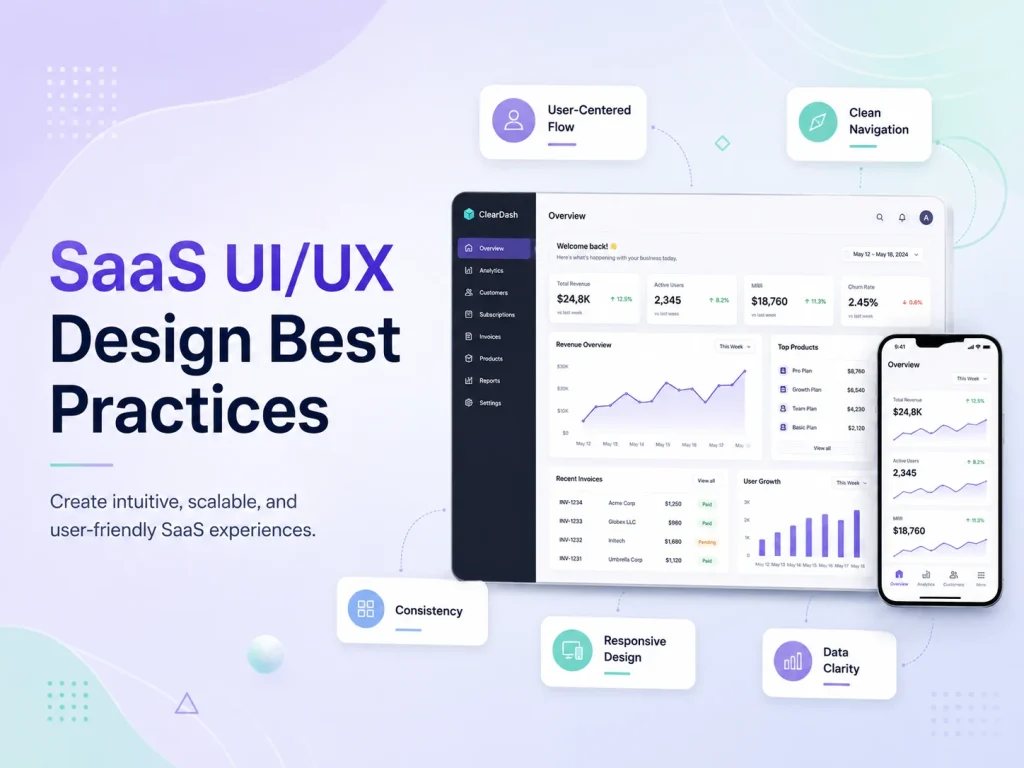
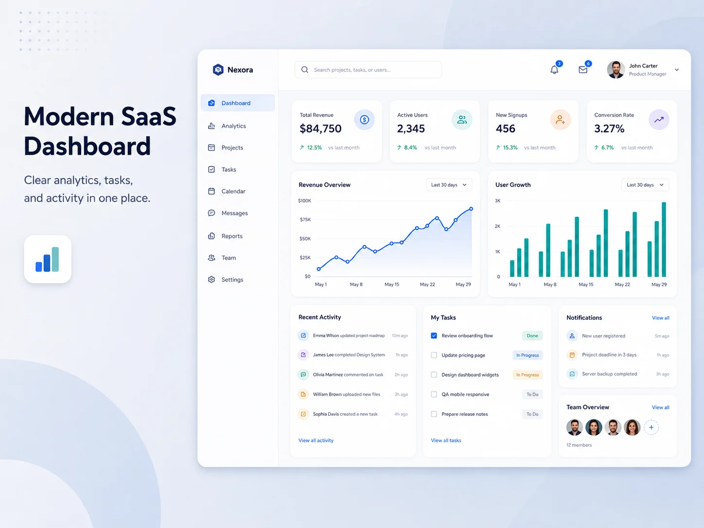
Personalization can improve engagement when it genuinely makes the app more relevant. An e-commerce application might remember preferred categories, while a learning platform can continue from previous progress. A SaaS product may show information based on the user’s role instead of presenting the same dashboard to everyone.
However, personalization should not create unnecessary privacy concerns or make the experience unpredictable. Users should still understand why information is being shown and retain appropriate control over their preferences.
Push notifications are another useful engagement tool when they provide timely value. Order updates, appointment reminders, new messages, payment alerts, or important account activity can give users a reason to return to the application.
Too many notifications have the opposite effect. Repeated promotional messages can lead users to disable notifications entirely or remove the app. Businesses should focus on relevance, timing, and user control rather than maximizing the number of messages sent.
Visual design cannot compensate for an app that feels slow. Delayed screens, large loading states, freezing interactions, and slow API responses can quickly reduce engagement even when the interface itself looks polished.
Developers and designers should therefore consider performance together. Images should be optimized, screens should avoid loading unnecessary information, API requests should be efficient, and useful loading states should appear when processing takes time.
The app should also handle poor network conditions gracefully. Users may move between Wi-Fi and mobile connections or temporarily lose connectivity. Clear retry options, cached information where appropriate, and understandable error messages create a more dependable experience.
Accessibility contributes to usability too. Readable typography, sufficient contrast, clear labels, scalable layouts, and controls that are easy to interact with can make the product more usable for a wider range of people.
Improve Engagement With Real User Behavior
Good mobile UX continues evolving after launch. Analytics can reveal where users leave onboarding, which screens receive the most attention, and which important actions are rarely completed. Support requests and app reviews can add context by explaining why users experience problems.
If many users begin checkout but do not complete it, the team should investigate that workflow rather than redesigning unrelated screens. If users frequently search for a feature that is hidden in navigation, its position may need to change. If a feature receives almost no usage, the product team should determine whether it is difficult to discover or simply not valuable.
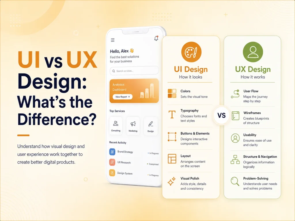
Encoder IT Limited provides UI/UX design and development for Android, iOS, Flutter, and React Native applications. Our work can include user-flow planning, wireframes, mobile interface design, design systems, responsive development, usability improvements, and ongoing product optimization.
Better mobile engagement usually comes from reducing friction rather than adding more features. When users can understand the application quickly, navigate confidently, complete important actions easily, and receive clear feedback throughout the experience, they have a stronger reason to continue using the product.