Customers increasingly visit business websites from smartphones and tablets, which means a website can no longer be designed only for desktop screens. If visitors need to zoom, scroll sideways, struggle with small buttons, or wait for oversized content to load, they may leave before understanding what the business offers.
Mobile-responsive website design allows a website to adapt automatically to different screen sizes while keeping navigation, content, images, forms, and calls to action easy to use. For businesses, this directly affects customer experience, credibility, lead generation, and how effectively a website supports sales and marketing.
A Better Mobile Experience Helps Keep Visitors Engaged
People use mobile devices differently from desktop computers. They often browse quickly, use touch controls, and expect important information to be available without unnecessary navigation. A responsive website reorganizes content so users can comfortably read text, tap buttons, complete forms, view products, and contact the business from a smaller screen.
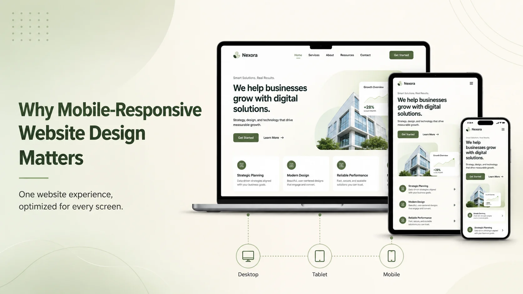
A desktop layout may contain several columns, large menus, detailed tables, or wide visual sections. On mobile, these elements need to adapt rather than simply shrink. Columns may stack vertically, navigation may become a compact mobile menu, buttons may become easier to tap, and images should resize without pushing content outside the screen.
This is particularly important on pages where visitors are expected to take action. A quote form that is easy to complete on desktop but difficult to use on a phone can reduce enquiries. The same problem can affect checkout pages, appointment booking, registration, product browsing, and customer-support forms.
Responsive Design Supports Trust and Professionalism
A website is often one of the first interactions a potential customer has with a company. If the mobile version looks broken or outdated, that experience can influence how visitors perceive the business itself.
Responsive design helps maintain a consistent brand experience across devices. Typography, colors, images, buttons, and page structure remain recognizable while adapting to the available screen size. Visitors should feel that they are using the same professional website whether they arrive from a desktop computer or a smartphone.
This becomes even more important when customers compare several companies. A business that provides clear information, simple navigation, and an easy mobile experience may appear more reliable than a competitor whose website is difficult to use.
Mobile Responsiveness Can Improve Conversions
Responsive website design is not only a visual requirement. It can directly affect whether visitors complete important business actions.
For example, someone searching for a local service from their phone may want to quickly view pricing, check availability, call the company, or request a quote. If these actions are hidden behind complicated menus or difficult forms, the business may lose a potential lead even though the visitor was already interested.
Businesses should make the most important actions easy to reach on mobile. Phone numbers can be clickable, forms should contain only necessary fields, buttons should have comfortable spacing, and important service information should appear before less relevant details.
- Clear mobile navigation
- Readable text without zooming
- Comfortable touch-friendly buttons
- Simple enquiry and contact forms
- Responsive images and media
- Easy access to important calls to action
A responsive layout can also make marketing campaigns more effective. Visitors arriving from social media, email campaigns, search results, or digital advertising frequently use mobile devices. If the landing page is difficult to use on their device, part of the marketing budget may be wasted before the customer even reaches the offer.
Improve Your Website for Mobile Users
A website can technically adapt to a smartphone screen and still provide a poor mobile experience if it loads slowly. Mobile users may be browsing through weaker connections, so large images, unnecessary scripts, heavy animations, and poorly optimized third-party tools can become especially noticeable.
Responsive development should therefore consider performance as well as layout. Images can be optimized for appropriate screen sizes, unnecessary resources can be reduced, caching can be configured, and frontend code can be structured so important content appears quickly.
Businesses should also test real pages instead of assuming that a responsive framework automatically solves every problem. Navigation, forms, sliders, popups, tables, checkout flows, embedded media, and interactive components should all be reviewed on different screen sizes.
Responsive Design Makes Future Growth Easier
A well-built responsive website provides one adaptable experience instead of requiring completely separate desktop and mobile websites. This can make content management and future development easier because updates can be made within the same website structure.
As the business adds new services, landing pages, e-commerce features, customer portals, or integrations, responsive components can be reused rather than redesigning every feature independently for each device.
Encoder IT Limited designs and develops responsive business websites, WordPress websites, e-commerce stores, custom web applications, and mobile-friendly interfaces. Our work includes UI/UX design, responsive frontend development, performance optimization, API integration, and ongoing website improvements.
Mobile-responsive website design matters because customers expect a website to work wherever they access it. A business website should provide the same clarity, trust, and ease of use on a smartphone that it provides on a larger screen.
When responsive design is combined with fast performance, clear content, and simple customer journeys, the website becomes better prepared to turn mobile visitors into enquiries, bookings, purchases, and long-term customers.